
Lessons from the American Cancer Society’s EverYou launch
When customers feel overwhelmed, trust is built by reducing decisions.
EverYou serves women actively in cancer treatment and recovery.
In that moment, the job of the site isn’t persuasion.
It’s to make the next step obvious and easy to take.
That principle guided every UX decision across the site.
1. The homepage makes it clear where to begin shopping
Instead of pushing products immediately, we designed the homepage to help customers quickly orient themselves within the catalog.
What we built:
- Flexible homepage sections the team can update for different moments and campaigns
- Banners with adjustable text placement, CTAs, and layouts
- A flow that alternates between shoppable sections and helpful resources
As customers scroll, they move between products and guidance (articles on hair loss, bra fit, recovery needs, and next steps) based on their journey.
The result:
Shoppers feel supported first, informed second, and ready to buy when it makes sense.
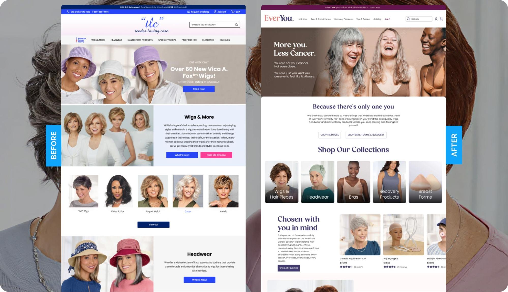
2. We simplified navigation so shoppers could orient instantly
Complex menus increase anxiety when shoppers are already under stress.
So we simplified the mega menu and reduced dropdown depth so customers could understand where to start in seconds.
Instead of showing every category at once, the navigation helps shoppers quickly narrow to what matters to them first.
Now, customers can begin browsing without feeling lost.

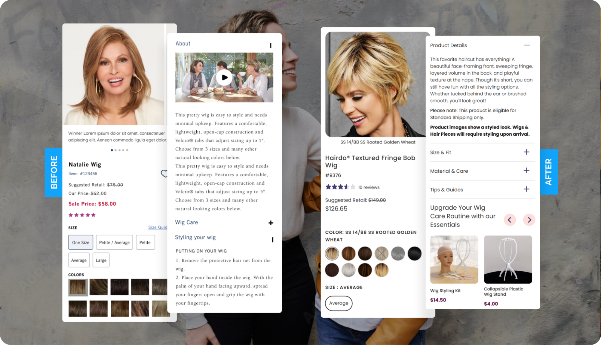
3. We helped customers find the right product without using the search tool
EverYou’s catalog spans wigs, headwear, bras, post-surgical garments, and recovery essentials.
That range is helpful – but only if it’s easy to navigate.
What we built:
- Collection pages that let shoppers control product density and visual scale
- Large “View all” categories with quick-access links to smaller, need-based groupings
- Two custom quizzes to guide bra and wig selection
The result:
Less typing, less scrolling, more confidence. Right when they need it most.

4. We reduced decision fatigue at product and checkout
Product pages feel easier to scan with:
- Larger imagery for better visibility
- Grouped information in dropdowns to prevent overload
- Clearer sizing charts and relevant guides by product type
- Hover states on variants for easier color and style comparison (especially for wigs)
Cart and checkout reinforced clarity:
- Helpful, low-pressure product recs
- Easy access to shipping, returns, and support information
The result:
Fewer questions at checkout and a smoother path to purchase.
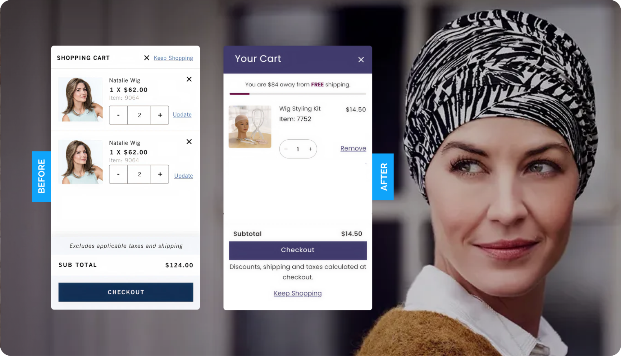
Tools that supported the experience:
- Rebuy for thoughtful, low-pressure product recs
- Quizell for guided product selection
- Simplified shipping so customers paid one clear fee at checkout
Each tool reduced friction without adding noise.
✨Takeaway: Great e-commerce design meets customers where they are. Reduce decisions before you try to persuade.
By simplifying navigation, guidance, and checkout, you build confidence.
Especially when customers need support more than selling.