
11% conversion boost from THESE icons on the homepage
Allen with Blue Stout here. It’s time for another CRO win rundown.
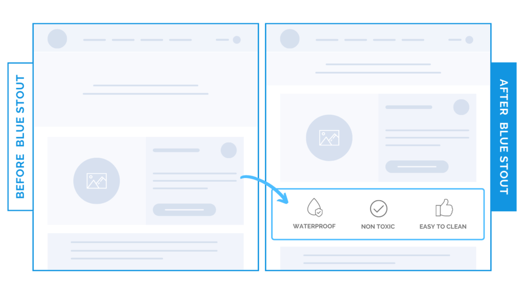
In a recent test, we added a benefit section, using only icons, in the middle of the homepage. This simple, well-designed addition locked in an 11% conversion boost.
To help communicate your brand’s *unique* selling propositions…
…add easily digestible product icons to your homepage.
Here’s Why it Worked
Helpful, easy-to-see, and unique benefits icons quickly introduce your benefits and give a reason to purchase from you instead of the competition.
The “Waterproof, Non-Toxic, and Easy to Clean” icons display in the middle of the page, lowering the bounce rate and increasing the likelihood of purchase.
What Most Brands Do Wrong
Most brands either assume customers already know the benefits of the product OR never identify the benefits that customers care the most about. By placing these early in their journey, you hook the customer on why they should learn more about your products.
You give them the MAIN pointers.
The fewer elements you have on the homepage (but well-intentioned and tested) the better. So choose yours wisely and test!
Try it out:
Are your product’s benefits on your homepage? Make sure they are unique and important to your customers. Display them with well-designed icons. Then, test, review, repeat.