13% conversion boost with major categories added to mobile homepage
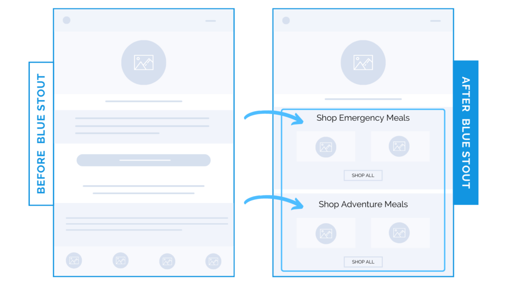
In a recent test, we added two product categories right below the hero section on a brand’s homepage to cater to different customers. This simple addition lifted conversions 13% on mobile.
You can cater to customers and STILL optimize for smaller screens.

Here’s Why it Worked
This CPG brand sells food for the outdoors. They don’t just cater to adventurers, though. They also make products for emergency/survival enthusiasts.
To make it easy to navigate to the right products on mobile (no wasting time here), we added two product category sections prominently on the homepage:
- “Shop Emergency Meals”
- “Shop Adventure Meals”
Each section features popular products in those categories with a CTA to the corresponding category page, instead of a vague ‘Top New Flavors’ section.
By providing customers with clear & distinct product categories tailored to their needs, we reduce the cognitive load of browsing…
What Most Brands Do Wrong
Don’t make your customer think. Especially on the homepage, and on mobile – where space is limited.
Show them exactly where they should go next.
Product categories for this CPG brand helped reinforce their value proposition, too, as customers quickly and easily identified the products that best suited their needs
Test it out:
Got multiple product categories for different customers? Show them exactly what step they should take next to avoid confusion (especially on mobile).


