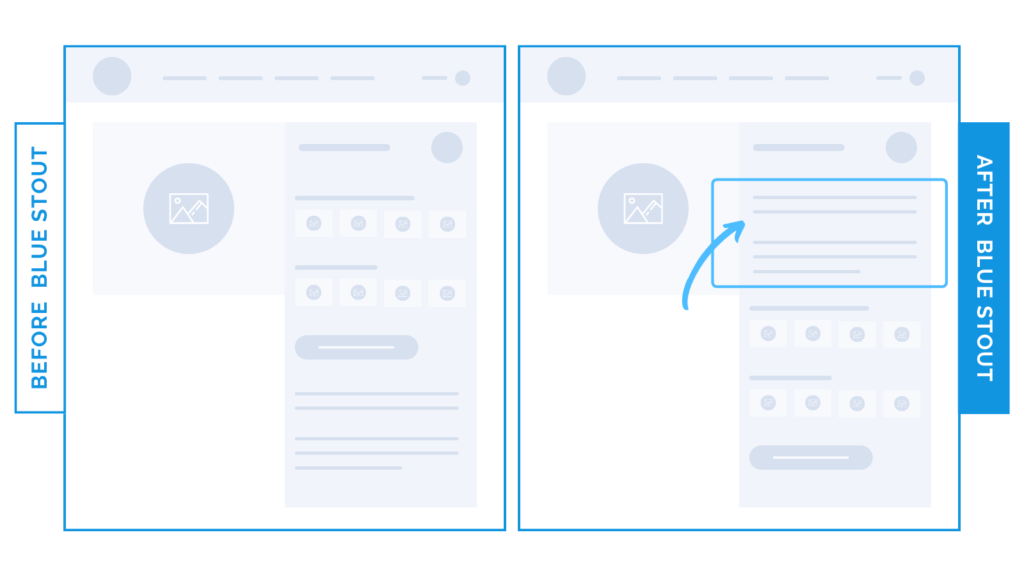
Don’t bury the lead. Move product info HERE for a 19% conversion increase.
In a recent test, we moved the product description from way down the page to directly below the title for a client, and it boosted conversions by 19%.
This particular client sells a niche custom product. Translation? TONS of info and options. Since we know roughly ⅔ of new site visitors will be brand new, we need to give these potential customers what they want: information. And fast.
…like, before they start customizing.
Don’t bury your lead. Use your words to inspire scrolls instead (no fluff necessary).

Here’s Why it Worked
Moving this product information up below the title and before the customization options allows the customer to be in charge. They don’t need to dig around for basic info, thereby allowing them to move with ease to the next steps – which should be fun, by the way.
What Most Brands Do Wrong
Most brands make a big effort to keep things streamlined, but end up cutting or burying the good stuff. These brands are losing people. Don’t leave anything out or make it tough to find – especially when it comes to custom products.
Use well-intentioned copy that answers the big questions and uses your brand voice FIRST.
Try it out:
Add exactly what a newcomer would need below your product title to avoid confusion.
Remember: keep this page focused on the facts, CTAs that intrigue, and UX that flows to the next stage with ease. Test, review, repeat.


