
This simple pop of color lifted conversions by 43%.
In a recent test, we saw a 43% uplift in conversions when we added contrasting color to a press endorsement section on a client’s homepage.
Good design attracts website visitors and stops them mid-scroll.
But GREAT design pops. It makes customers read, engage, and stay on the page.
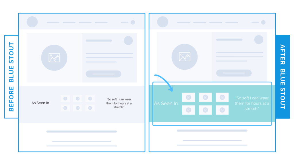
Our client already had social proof logos from top sources next to a quality quote.
All we did was bump up the font size a bit & add color to the background in line with the client’s branding. It paid off.
Here’s Why it Worked
Adding a well-contrasted pop of color to the background of your social proof sections keeps visitors from scrolling past, where they’d potentially miss out on key info that could tip the scales in favor of purchase.
Your customer wants to know that your product is loved. Bonus points if a high-quality source endorses it.
Make this info easy to discover.
What Most Brands Do Wrong
Most brands think pops of color tend toward loud & distracting – that it can take away from the copy or message they’re trying to get across.
So they don’t try it at all.
But when you use it in contrast with other important elements, it catches their gaze and leads with the key info you want them to know.
Contrasting color backgrounds on a social proof section is an overlooked addition that could make a big difference in your CVR.
Try it out:
Have social proof on your homepage? We sure hope so. Add a color background to it (that’s in line with your branding), and THEN test. From here, experiment with other elements.