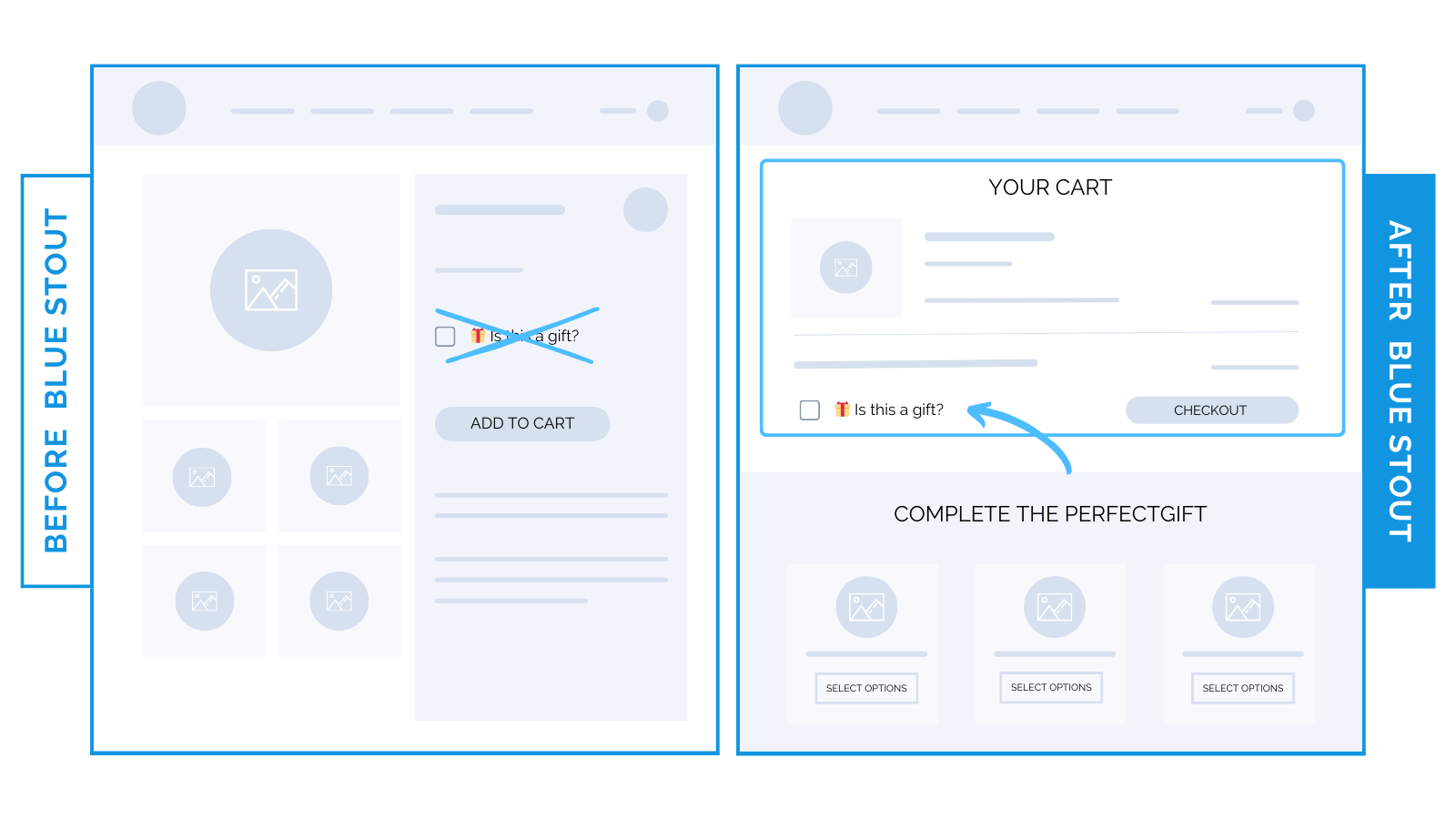
A checkbox removed from luxury home goods brand’s product page lifts conversions 6%.
Relocate non-essential features on your product page to later in the buying process.
Don’t ask customers to make an extra decision before they decide to purchase.
Previously, our luxury home goods brand incorporated a, “Is this a gift?” checkbox right on the product page.
To streamline and optimize, we moved it exclusively to the cart page.
In addition, the add-to-cart button was positioned higher on the product page.
This change resulted in a 6% boost in conversion rates and a 5% upswing in Average Order Value (AOV).

Here’s Why it Worked
The, “Is this a gift?” checkbox on the product page (although well-intentioned) diverted the buyer’s attention from the main objective: purchasing the product.
By eliminating this distraction, we ensured a straightforward journey from product to cart.
Simplify the process, make it intuitive, and avoid unnecessary sidetracks.
What Most Brands Do Wrong
Many brands incorporate features they think will enhance user experience.
However, what seems beneficial may unintentionally hinder the purchase process.
Adding too many options or questions on the product page can create decision fatigue, or worse: distraction.
Remember: the main goal of your product page is to inspire a purchase.
Every element on that page should be laser-focused on achieving this.
Steps to Try Today
Do you have messages on your product page meant for later in the buyer journey?
Follow this guideline to streamline:
- Ask: Is this helping or hindering their purchase decision?
- Remove non-essential elements to later stages in the buying process.
Then, test and refine based on your data.


