Add contrast to boost conversions by 16.3% or more. Here’s the scoop.
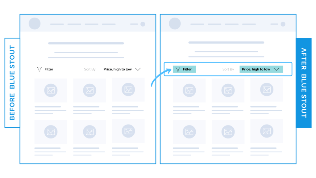
In a recent test, we added button styling to the Filter and Sort selection on our client’s Collection pages, resulting in a 16.3% increase in conversion rate and a 26% increase in the likelihood of customers using the sort/filter functions.
Turns out, the lack of contrast on these features was causing users to overlook the functionality.

When it comes to your Collections page, make sure each element of your UX design leads your customer’s eyes exactly where you want them to go. If you can add a simple addition, like a bold outline to draw their attention, great!
Go for it. It could be the missing link you needed.
Here’s Why it Worked
Adding this bolded black contrast on an important Filter and Sort feature allowed visitors to get to the product they were interested in that much quicker. Less confusion, more user-friendly design.
After all, what’s the point of adding these helpful sections to your site if they’re going to be passed right over and underutilized?
What Most Brands Do Wrong
Most brands overlook the significance of a simple design change. If used appropriately, it could change everything on your site. We’re aiming for user-friendly above all else – especially on mobile.
Place an outline around, or a background color behind, the filter and sort bar on mobile to draw more attention to the feature, which may currently be getting lost alongside the white background of your navigation bar.
Try it out:
Take inventory of your site by performing a quick audit. Are there any buttons or features that are hard to make out? (Put yourself in a new visitor’s shoes!) If so, add a contrasting element to make it pop. Then, test, review, repeat.


