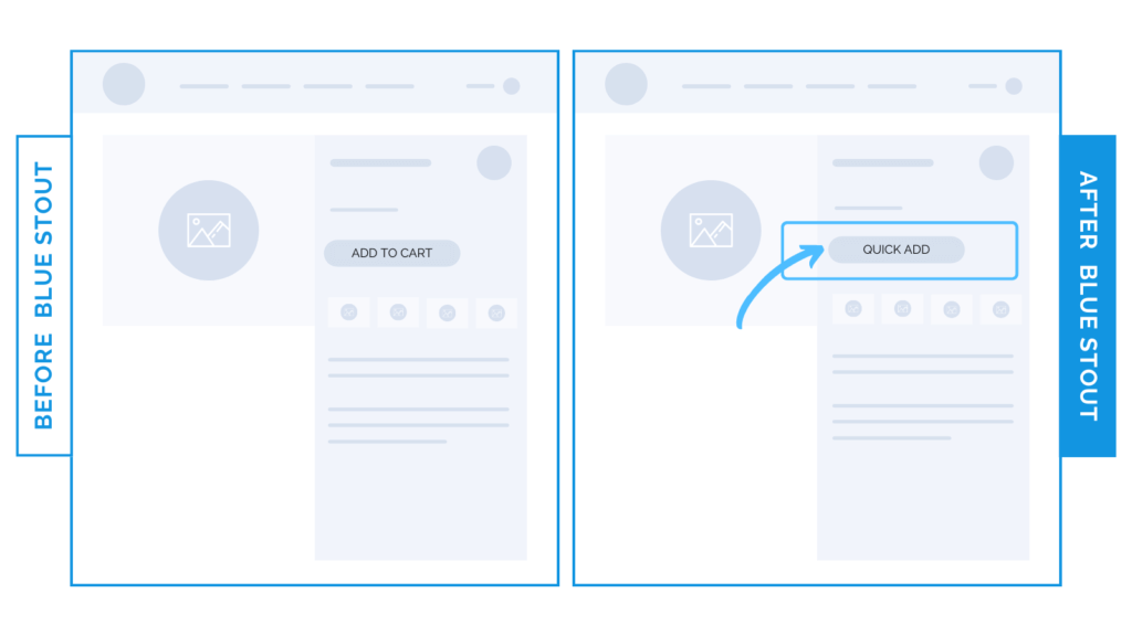
Change your ‘Add-to-Cart’ button copy for a 25% increase.
Recently, we copy-tested ‘Quick Add’ vs. ‘Add to Cart’ as a call to action. ‘Quick Add’ won, boosting conversions by 8.6%, with a 24.6% increase in the ATC rate.
Always TEST and question best practices wherever possible.
Bonus points if your phrasing is strong and inspires movement.

Here’s Why it Worked
Some phrases just work better for different audiences. Going with ‘Quick Add’ vs. ‘Add-to-Cart’ or ‘Select Options’ might help some customers quickly distinguish this feature to see more product details, while ‘Add-to-Cart’ works great for others.
The word ‘Quick’ feels slightly more personable & less pressured than a stark, ‘Add’ or ‘Select.
BUT, the key is to test.
What Most Brands Do Wrong
Most brands don’t even bother to test different CTA button copy, let alone experiment with slight language shifts.
Don’t be like them. Come up with alternate (but SIMPLE) phrases that tell the customer exactly what to do.
Try it out:
Try swapping out your add-to-cart copy with a stronger phrase, like ‘Quick Add’. Test, review, repeat.


