
Diversified color on product badges leads to a 13% conversion lift on collections page.
This apparel brand has a distinct color scheme, with all buttons, navigation elements, and attributes in bright blue.
As a result, on the collections page, their “New” and “Collab” products were lost in a sea of blue.
This made it difficult for customers to choose the right product to visit.
We decided to:
- First, adjust the color of the product badges.
- Then, use two different colors to add a visual distinction between the two types.
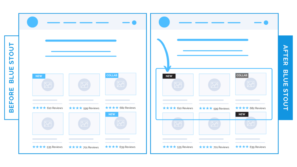
It worked.
Here’s Why It Worked
Product badges help customers find what they’re looking for quickly.
The original badges showed different product groups, but were STILL the same color.
Using two distinct tones (black and gray) reinforces the hierarchy and helps these products stand out from one another.
What Most Brands Do Wrong
Most brands are so attached to their color scheme that user-friendly changes often take a back seat.
Using one color makes product groups appear the same, even when the messages are different.
Make it clear to customers that your product groups are different.
Steps to Implement Today
Where can you make the path to your products more clear?
Improve site usability by making it EASY for your customer to choose which product to focus on.