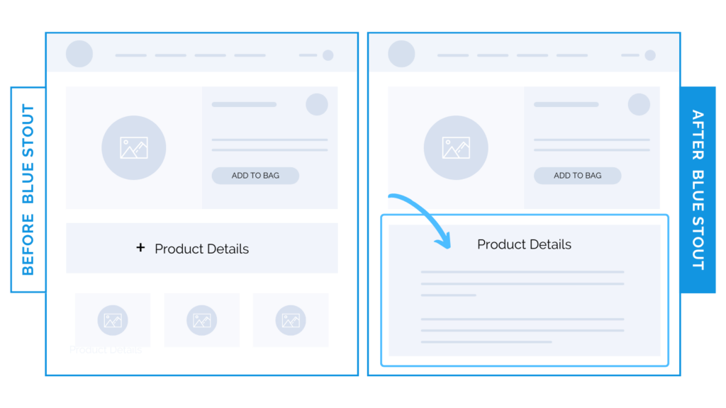
Don’t bury your details behind a “luxury” design. 20% CVR study.
In a recent test, we expanded product details on the PDP from a closed section that had to be clicked open to read. This one change brought a 20.3% lift in conversions on mobile and desktop for a fashion brand.
Our goal is to ELIMINATE friction on the product page and keep details easy to consume.
You can have a beautiful brand look, AND keep it optimized.

Here’s Why it Worked
In this case, placing the product details within the first scroll on desktop and mobile makes it EASY for the customer to make an informed purchase in record time.
This brand sells handbags. Details are key.
Their customers want to know:
What are the dimensions?
What is it made of?
How can I use it and what can fit inside?
Paint the picture. And do it early.
By expanding the product details onto the page, we also avoid issues on smaller screens, where the opened version of the collapsed description could create friction in adding to the cart.
What Most Brands Do Wrong
Lots of fashion and luxury brands overly design their pages, forcing the important details to get lost in the noise. Or, they hide ‘em all together in an expandable field.
Even when brand aesthetic calls for a highly designed luxury experience, you need to ensure customers can find the important info quickly and easily.
Some brands assume product details in an add-to-cart bar will make purchases more likely, and save space and scroll time.
However, collapsing information does the opposite of the intended customer experience:
It hides key details that would make a purchase quick and easy.
Try it out:
Could your design be causing friction? Consider placing key product details high on the page. Then, test, review, repeat.


