How to use icons to increase impulse buying and enhance product understanding.
Use iconography to enhance product understanding and increase impulse buys.
#1 – On mobile, sell with scannability.
Most site visitors are scanning for the information they need.
Make sure your product benefits are short, digestible, and easy to see to encourage scroll depth.
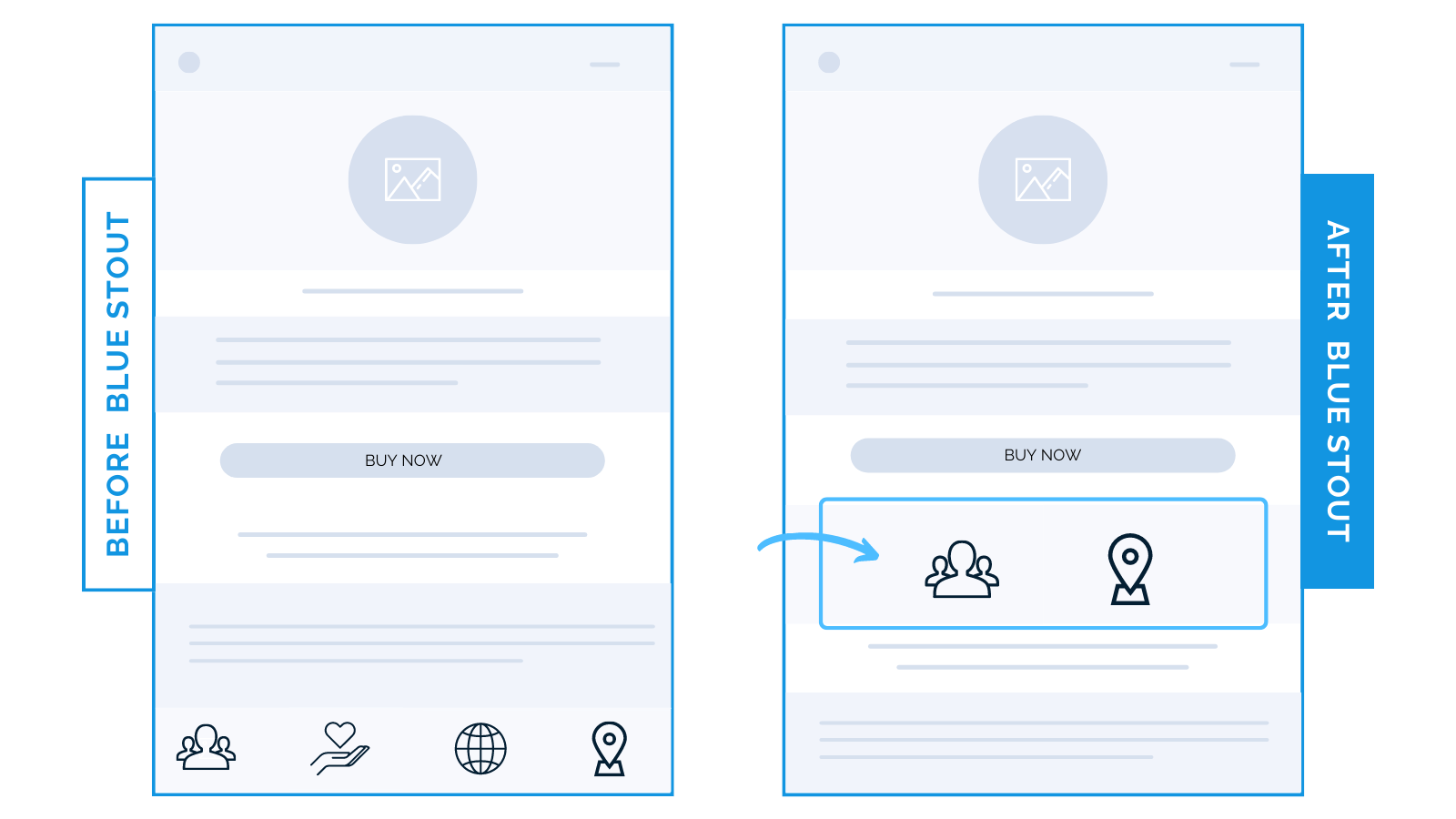
For a CPG brand, we moved 2 out of 4 benefit icons from lower on the page to higher up below the buy box. It generated a lift of 23.5% in conversions on mobile.

Try it out: test placing two benefit icons below your ATC button. They may just catch their eye, encourage further scrolling, and increase motivation to buy.
#2 – Put your top selling propositions right where they purchase.
Get creative with your icons.
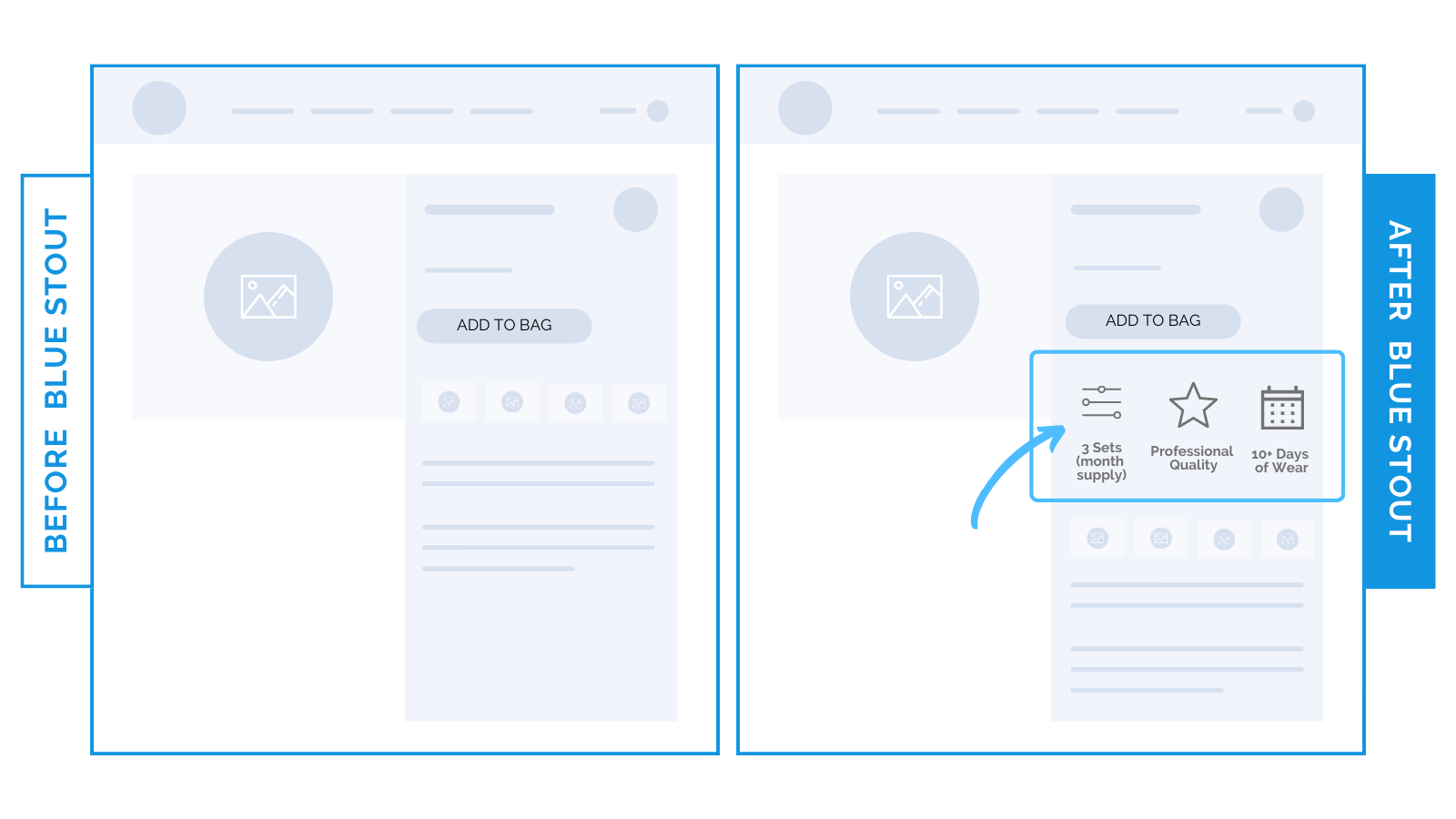
For a beauty brand, we tested adding their Unique Selling Propositions next to the ATC button. This boosted conversions by 11%.

Repeat your brand’s easy-to-scan value propositions where it counts. These icons remind customers at the point of purchase WHY they should buy.
Put this key info where they decide.
#3 – Use icons to break up product benefit copy.
Use product-specific benefit icons over brand benefit icons for an early emotional connection.
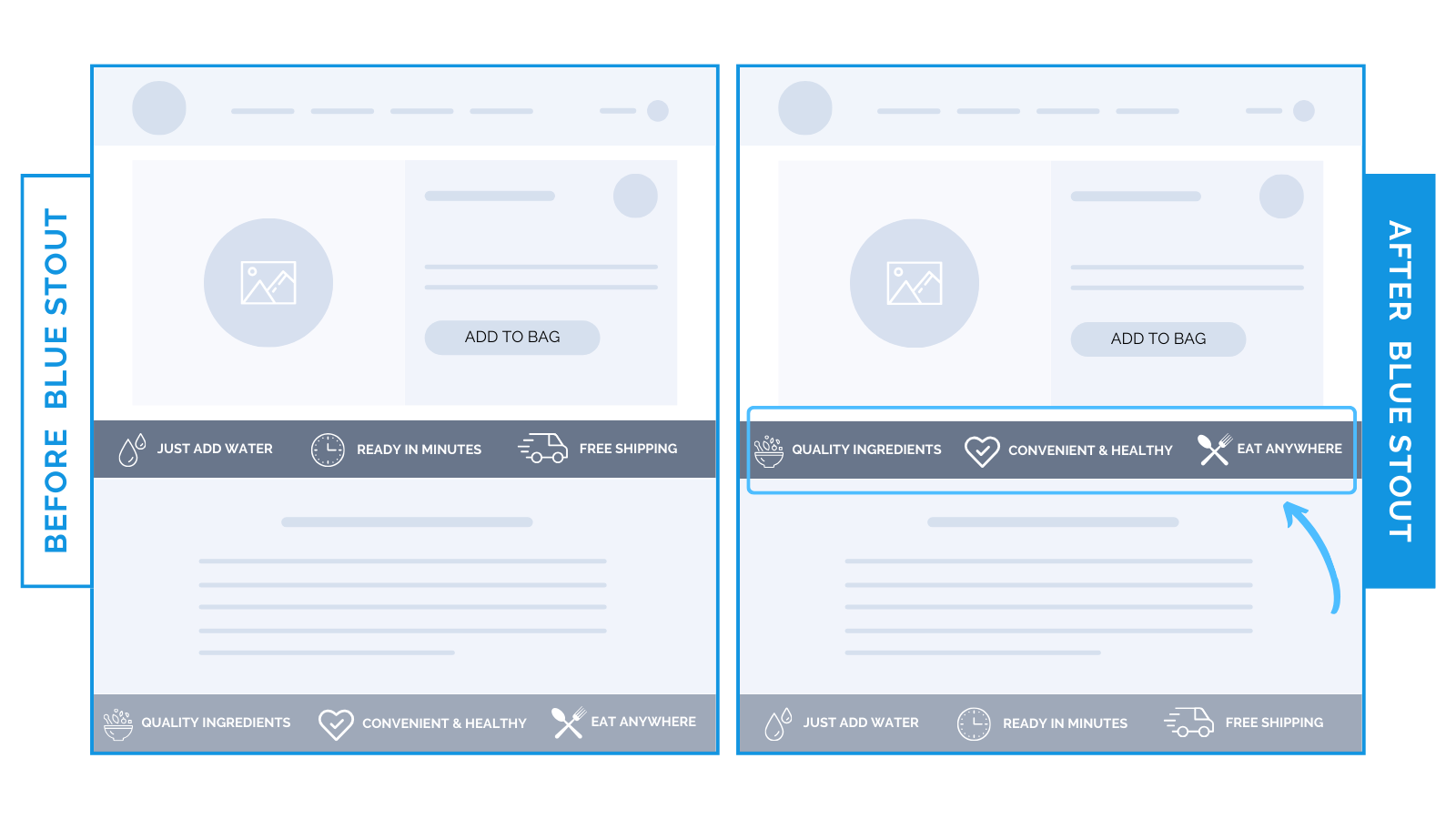
One of our CPG brands caters to outdoor enthusiasts. Their best-selling product had two different icon bars featured on the product detail page:
- Brand-specific benefits: “Just Add Water,” “Free Shipping”, etc.
- Product-specific benefits: “Quality Ingredients”, “Convenient and Healthy”, etc.

We switched the order of these icons to product-specific at the top of the page, lifting conversions on mobile for their best-seller by 7.6%.
Specific attributes presented HIGH on the page leave room for an emotional connection to form, better product understanding, and impulse purchases.
Only after product details should you introduce brand selling points on the product page.
#4 – Don’t let obstructions interrupt purchase flow.
Remove visual obstructions on the product page.
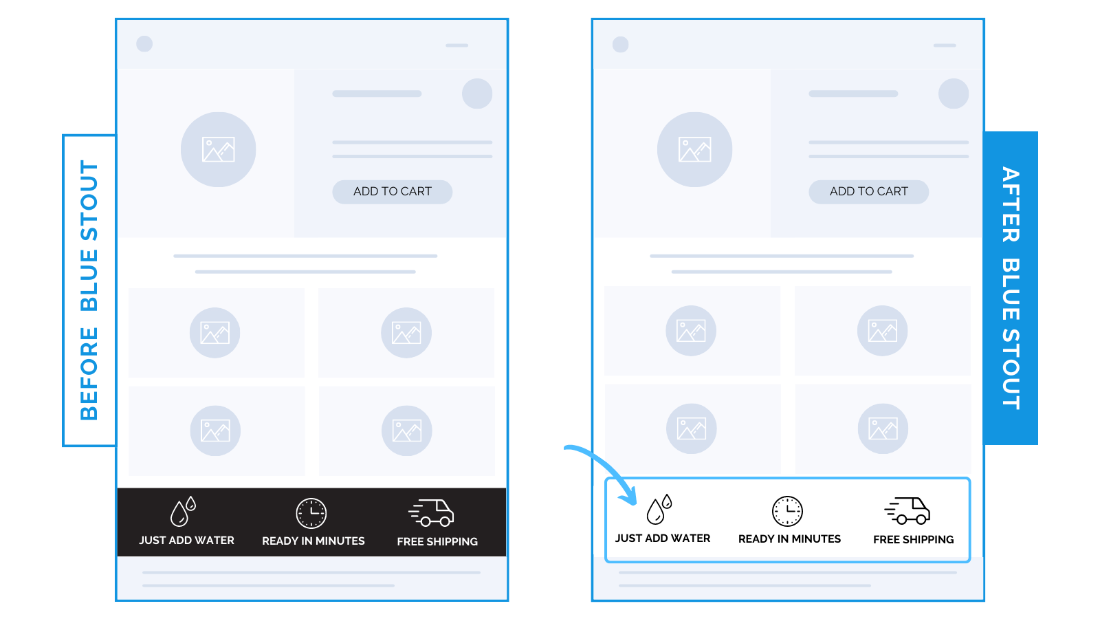
We simply changed the color of an icon bar from black to white to make it less obtrusive. This design switch led to a whopping 29% rise in conversions.

The dark icon bar looks like the end of the page, when it was far from it.
Instead, a white background with black icons opens up the page to encourage further scrolling.
No matter how significant the info displayed in these designs, if it looks visually obstructive, you’re losing people.
Steps to Try Today
Today’s takeaways to make the best of icons:
- On mobile, sell with scannability.
- Put your top selling propositions where they purchase.
- Use icons to break up product benefit copy.
- Don’t let obstructions interrupt purchase flow.


