
Stand out with copy that converts in these crucial spots on site.
Stand out with strong copy that converts with these 4 tips.
1 – Be simple and specific.
Clarity is critical to navigation. Use the language most customers will understand.
If you’re vague or too clever with your copy and it inspires a “what?” or “umm, I’m not sure” — you’re in trouble.
One of our children’s apparel brands had a drop-down link on their header menu that read, ‘Shoppe by Karen’ to show the founder’s favorite products.
We changed the language for this category header to: ‘Founder’s Faves’, and it led to an 8.1% lift in revenue per session.
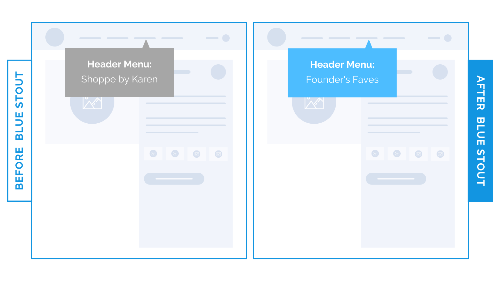
Old: ‘SHOPPE BY KAREN’
New: ‘FOUNDER’S FAVES’
The visitor doesn’t know who Karen is, so why would they care?
2- Sell a transformation, not features.
All customers will arrive at your site with a specific problem, and wonder: “What’s in it for me?”
When trying to persuade someone, it’s not enough to just say something positive about your brand. Consider emotions.
For example, take one of our luxury jewelry brands. Their homepage previously focused on features, not the benefit to the customer.
We changed it to a phrase packed with emotion that spoke directly to the customer (notice the “you” language) for a 3.8% bump in conversions.
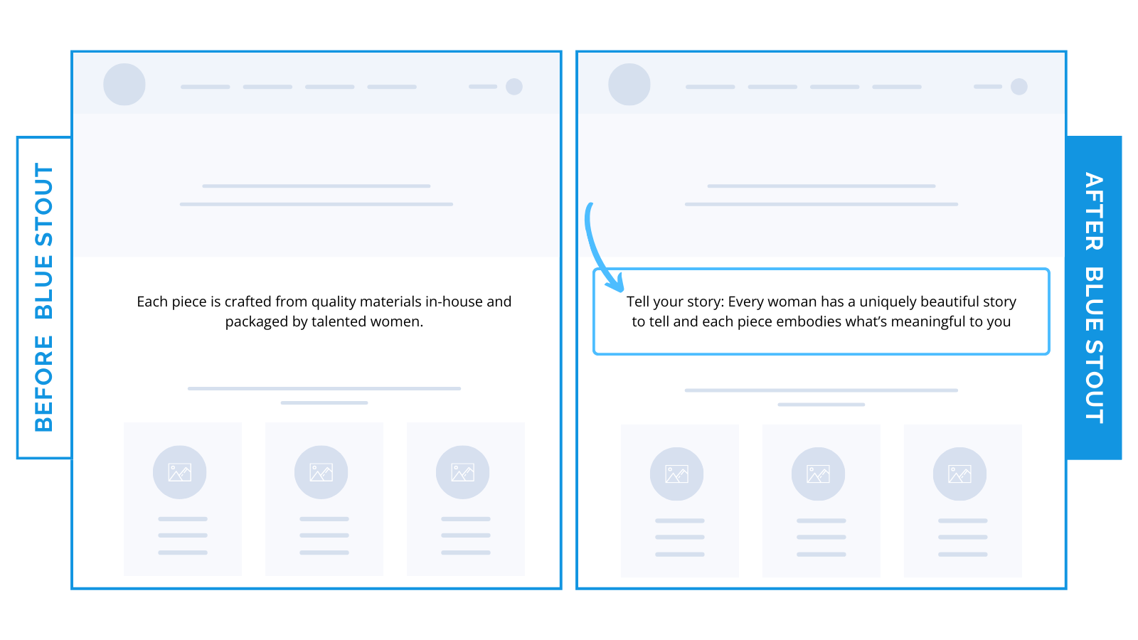
Old: “Each piece is crafted from quality materials in-house and packaged by talented women.”
New: “Tell your story: Every woman has a uniquely beautiful story to tell and each piece embodies what’s meaningful to you.”
Especially if the product is hedonic in nature (bought for enjoyment) emotions inspire purchases.
Show them directly how your products will improve their life and why they can trust you. Do this early for best results.
3 – Anticipate customer confusion and solve it in your titles.
Put yourself in a new site visitor’s shoes:
Are your collection titles too general?
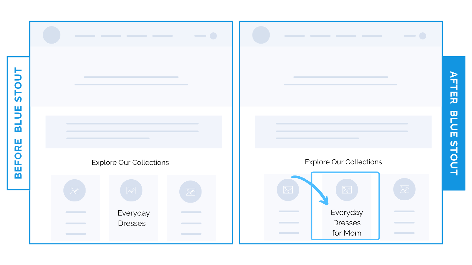
We added specificity around a product category to help visitors understand who the product is for (they sell products to two different audiences: kids and mothers).
Adding two words to the collection title more than doubled the traffic to the collection and increased sales by 16.7% from the homepage.
Old: ‘Everyday Dresses’
New: ‘Everyday Dresses for Mom’
Ultra-specific copy does the leg work for you.
4 – Different audiences react to different phrasing.
Never underestimate the power of call-to-action copy changes.
It tells you a lot about your audience.
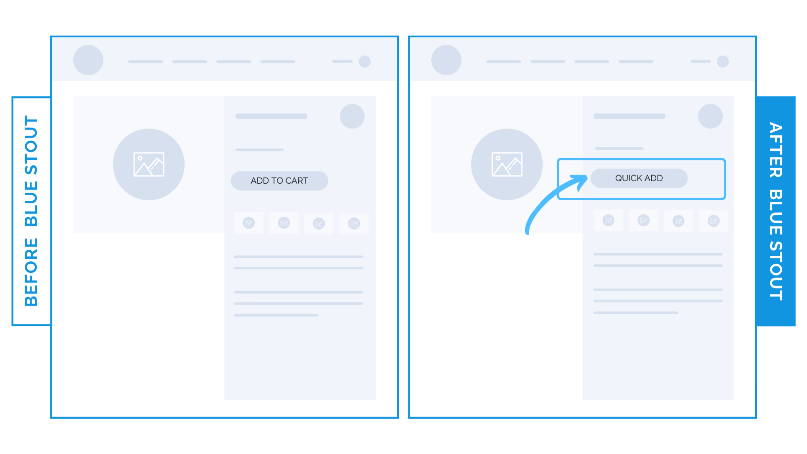
We switched up one CTA from the standard ‘Add to Cart’ to ‘Quick Add’. The second won, boosting the ATC rate by 24.6% and conversions by 9%.
Old: ‘ADD TO CART’
New: ‘QUICK ADD’
Most brands don’t test CTA button copy, let alone experiment with slight language shifts.
Some phrases just work better for one audience vs. another. Therein lies the importance of testing.
For repeat buyers in a time pinch who are done browsing? ‘Quick Add’ may give the illusion of a faster purchase, incentivizing them to buy.
But remember: direct and clear copy always wins. It’s not worth getting fancy if just one person is confused.
Steps to Try Today
Today’s takeaways to turn site readers into buyers:
- Be simple & specific.
- Sell a transformation, not features.
- Solve for customer confusion in your titles.
- Different audiences react to different phrasing.
The smallest copy changes can make the biggest splash.
Want to avoid copy as a barrier to conversions?
Save this letter, screenshot to use in your future tests, and don’t forget to TEST!