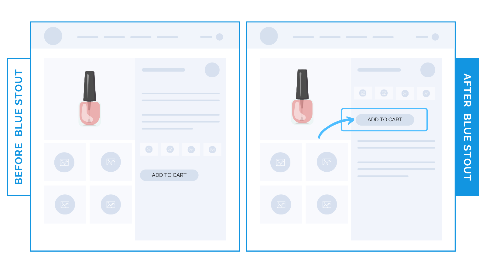
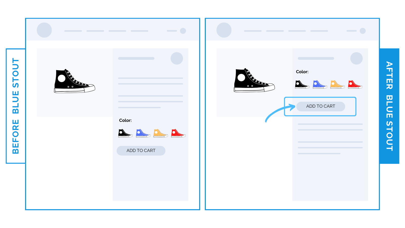
For products that are more visual in nature, move ATC up for higher conversions and increased revenue.
For products that don’t need much nurturing, position your add-to-cart button above product descriptions for a faster checkout.
Your site is a constant balance of commerce and content.
Make it easy to checkout, but provide the right amount of info.
For some products, a low-effort, faster checkout experience with minimal content keeps more buyers in the funnel.
Here’s two real examples:
#1: For a beauty brand, we saw a 9.6% increase in Average Revenue Per User (ARPU) when we moved their add-to-cart button higher up on the product page.

This brand sells nail polish.
It’s an everyday product that people purchase frequently with minimal effort, so a lengthy description is less valuable before checkout. Focus on speed and ease instead.
Good rule of thumb:
1) If your products need more nurturing (like electronics or supplements), descriptions are much more valued before the next step: add-to-cart.
2) For products that don’t need much explanation, help keep those ready to buy in the funnel by moving your ATC button above descriptions.
✨ Takeaway: For everyday products, most buyers value the ease of checkout more than the paragraph which describes the item.
#2: For a high-end footwear brand, conversions (CVR) lifted by 25% when we moved the add-to-cart button higher up on the product page.

Don’t make them scroll to find your call-to-action.
This brand offers color options for their footwear. Before, the product description pushed the color swatches and the add-to-cart button down the page.
Now, with the ATC higher up, more buyers can take action immediately after choosing their color.
✨ Takeaway: For products where visuals do the selling, go for speed and move their next step (add-to-cart) higher up.
Then, as always, test!


