Outdoor brand’s new product imagery lifts conversions on home and product pages.
Optimize your bundle product images to show volume and variety.
In ecommerce where customers can’t physically handle products, visuals are crucial.
Our client, an outdoor CPG brand, has bundle offerings with up to a 1-year supply of products included.
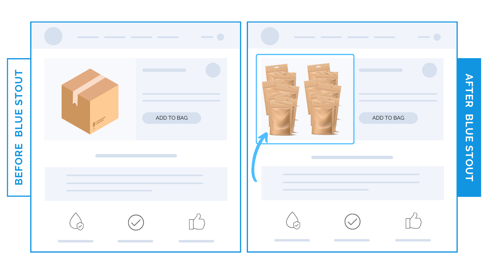
Only one problem: the product image showed only the packaging, failing to convey the actual volume and variety of contents.
We added multiple products to the image to demonstrate the bundled offer, leading to an uplift in conversions on both homepage and product pages.

Here’s Why it Worked
Visuals that show volume enhance the perceived value of your product.
This display of abundance and variety was more appealing than showing one product in the photo.
Why?
- Volume Translates to Value: New imagery showed an array of products, communicating the value of the bulk purchase in one glance.
- Customer Clarity: While the assortment wasn’t indicative of all contents, it gave customers a much clearer idea of what to expect, reducing uncertainty.
- Engaging Visuals: The abundant display was more informative AND visually engaging, making it more likely to catch and retain attention.
People want more bang for their buck. Volume and variety drive sales, especially for higher-priced bulk offerings.
What Most Brands Do Wrong
Many brands fail to show their bundle product’s value in photos, so they opt for a standard packaging shot.
Don’t be afraid to show MORE in your images. It doesn’t have to look cluttered.
Instead of settling for a simple product shot, do your offer justice by showing the true value with imagery that depicts volume (using numbers, tasteful product overlays, etc.)
Steps to Try Today
Do your product photos adequately show the value of your bundle offers?
If not, experiment. Try an image that shows multiple items.
Then, test, review, repeat!


