
The benefit placements that lifted sales up to 16% by speeding up decisions
Your copy might be great – but it only converts if buyers see the right value at the right time.
Across product pages, most brands make one of two mistakes:
They bury the key benefits too low, or they overload the buy box with too much detail.
Both kill momentum.
At the point of purchase, shoppers want to know:
“What will this do for me, and why should I buy it now?”
Where that answer appears decides the sale.
Here’s how three brands did it:
1) Wellness tech brand pulled benefit icons higher on the page.

Result: +9% CVR
Features like “Cooling” and “Remote Control” were hidden below reviews. Great proof, but too late in the scroll.
We pulled those icons above the fold, closer to the buy zone.
Conversions lifted 9%.
Buyers don’t want to dig for proof. They want to see the real-life value first.
2) Supplement brand moved long ingredient details below the “Add to Cart” button.
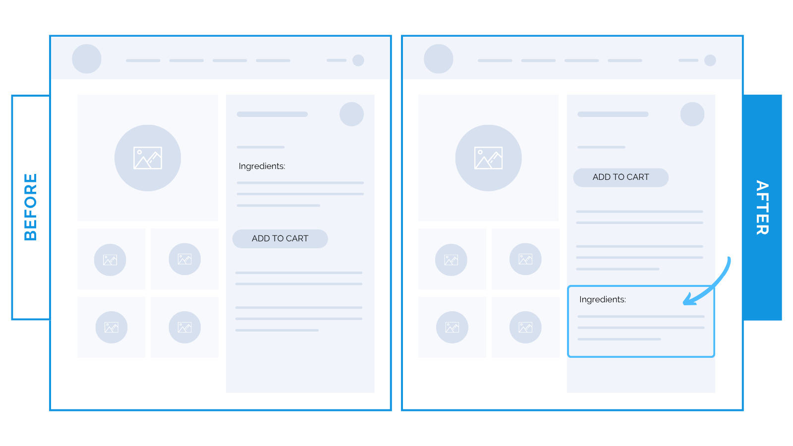
Result: +5.8% RPV
This brand had a loyal returning customer base.
But long ingredient descriptions forced unnecessary scrolling for repeat buyers.
We pushed those sections below the CTA. Still visible for new visitors, but out of the way for ready-to-buy customers.
The change removed friction and sped up checkout for high-intent buyers.
3) Fashion brand added a short product description above the “Add to Cart” button.

Result: +16% CVR, +4.6% RPV
Most fashion brands rely on visuals alone. But imagery can’t explain WHY an item is worth the price.
We tested pulling one short, benefit-led line (“Italian leather, lifetime repair guarantee”) above the buy button.
That reminder of quality and longevity at the exact moment of decision drove a 16% conversion lift.
✨ Takeaway: Your best selling points belong where decisions happen.
Move great copy and benefits closer to the buy moment: above the fold, next to your CTA, or inside your first few product images.
The faster shoppers see the value, the faster they buy.