
CRO WINS
This controversial homepage test lifted conversions 32% for a fashion brand.
Move vague brand statements down and high-revenue collections up for easy shopping on the homepage.
Let’s talk brand icons. Very popular, but often quite generic.
The hope is that they’ll capture emotions early and increase scroll depth.
But – if they aren’t specific enough to your brand, they can distract.
Here’s how to avoid losing people with irrelevant content.
We flipped brand icons and a ‘Shop Collection’ button at the top of an apparel brand’s homepage. It shifted icons down and the call-to-action button up for a 7% lift in mobile conversions.
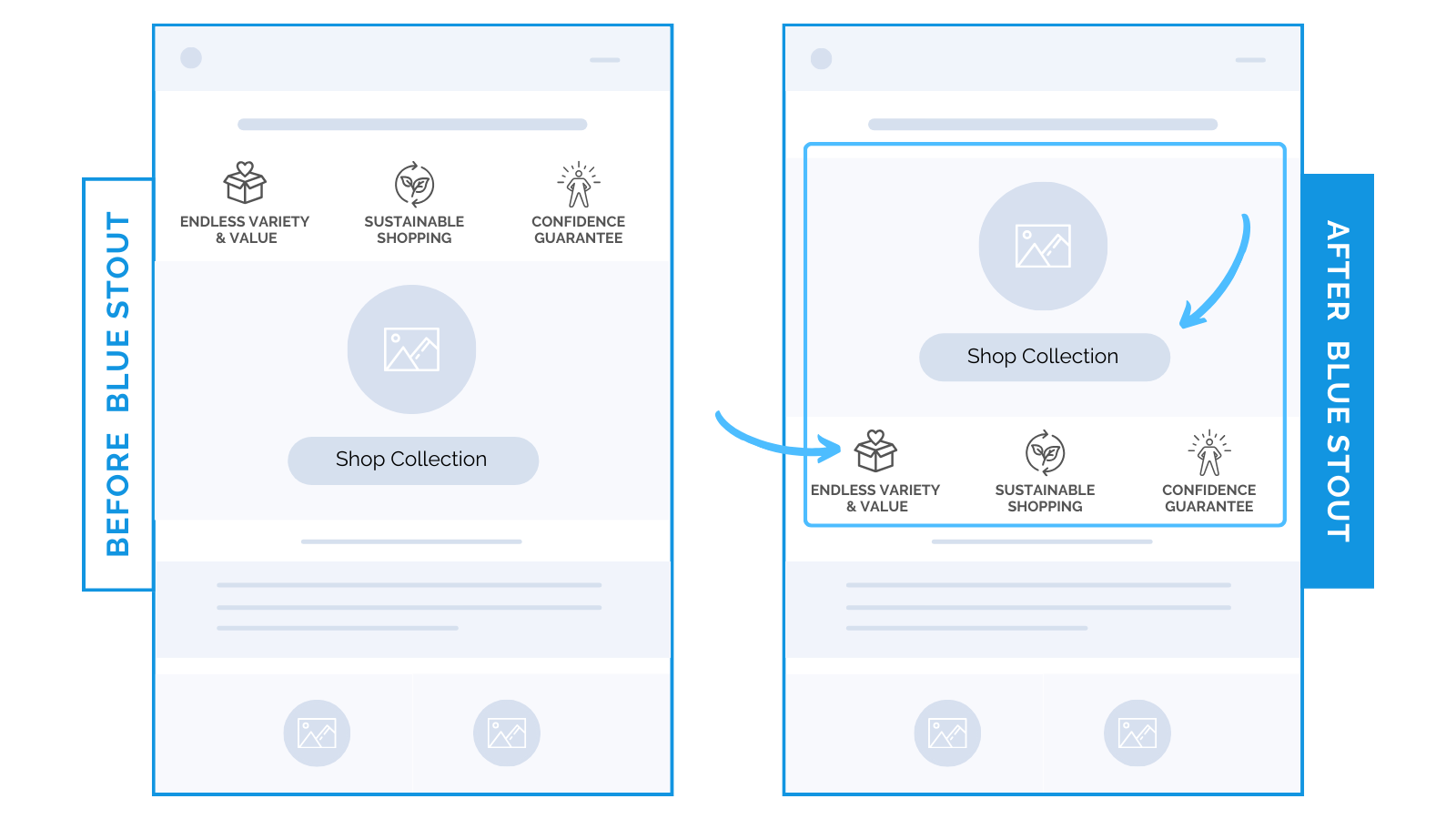
Linking to your best collection first could outweigh the value of brand statements – especially if they aren’t necessarily unique.
For this apparel brand, shoppable content was more valuable to their buyers at this early stage.
Although brand statements are important for nurturing new customers, they tend to distract on a small mobile screen.
 Mobile Takeaway: Don’t interrupt shopping with vague brand propositions. Unless they are unique to your brand, move your high-revenue collection up to take advantage of this prime real estate.
Then, as always, test!