
The browse abandonment email mistake almost every brand makes
The highest-converting browse abandonment emails remind shoppers why they cared in the first place.
Think about how someone actually browses your site.
Nobody clicks randomly.
They’re narrowing in on something, trying to solve a problem.
But when they leave and get your abandonment email later, they see the same message every brand sends:
“You left something behind.”
Confusion sets in. Now they have to think:
What was I looking for again?
Which option felt best?
What page should I go to now?
Instead, try this:
Shift from product reminders → intent-based messaging
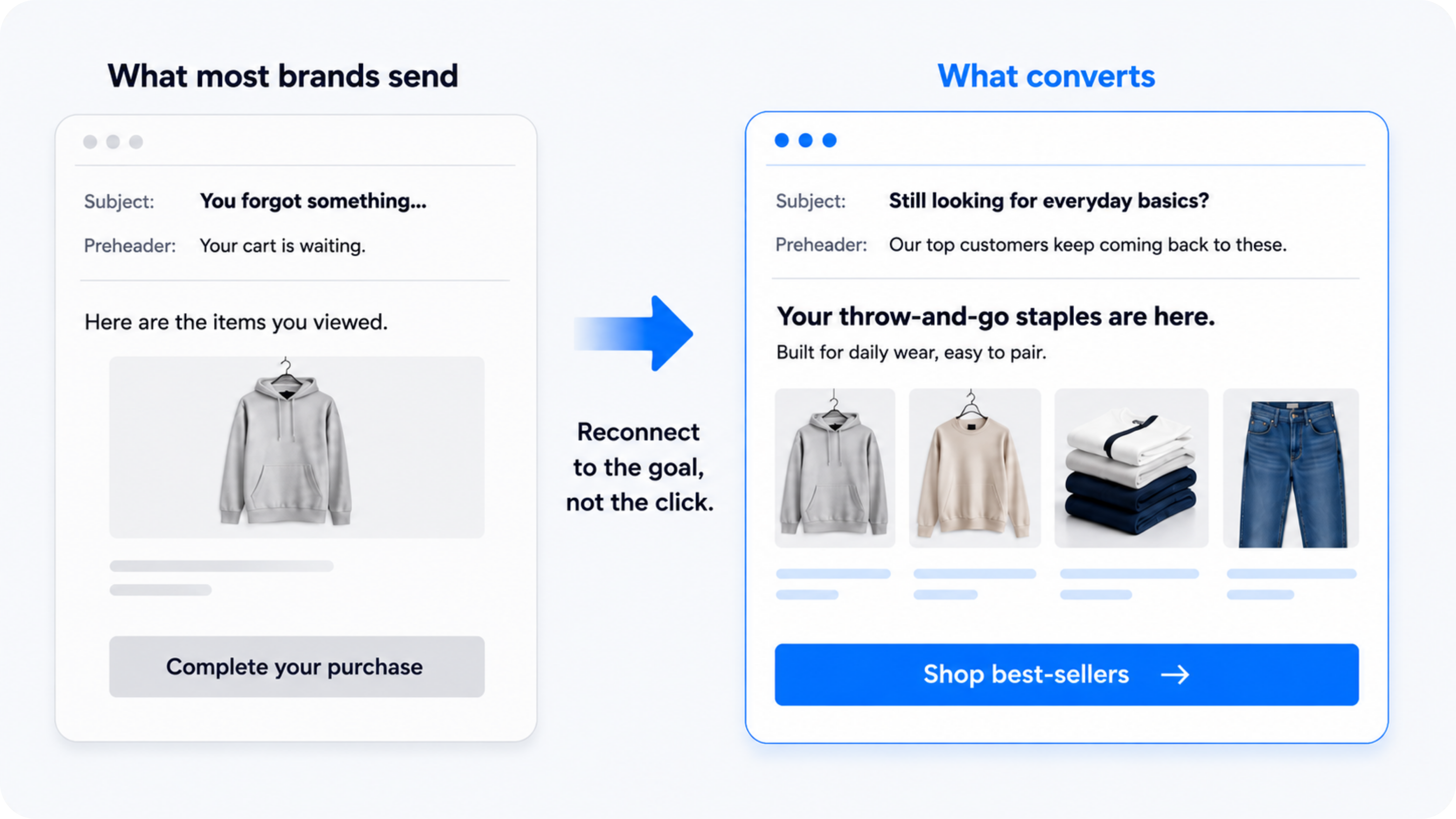
For one fashion brand, click-through rate increased 22% compared to their standard browse emails with this exact formula:
Standard:
Subject: You forgot something…
pre: Your cart is waiting.
Body:
Here are the items you viewed. Complete your purchase now.
Better version:
Subject: Still looking for everyday basics?
pre: Our top customers keep coming back to these.
Body:
Your throw-and-go staples are here.
Built for daily wear, easy to pair.
CTA: [Shop best-sellers]
See the difference?
The first email reminds them what they viewed.
The second reconnects them to what they were trying to find.
Focus the email in one direction: a popular use-case, category, or pain point.
Cheat sheet:
- Keep the email focused on a single category or intent
- Show 2–4 relevant products (max)
- Reinforce why customers choose this type
Make it easier to continue, not reconsider.
How to implement this:
Start by grouping your products into clear categories or use cases…
- “The core classics”
- “High-protein snacks”
- “Eco-friendly essentials”
- “On-the-go products”
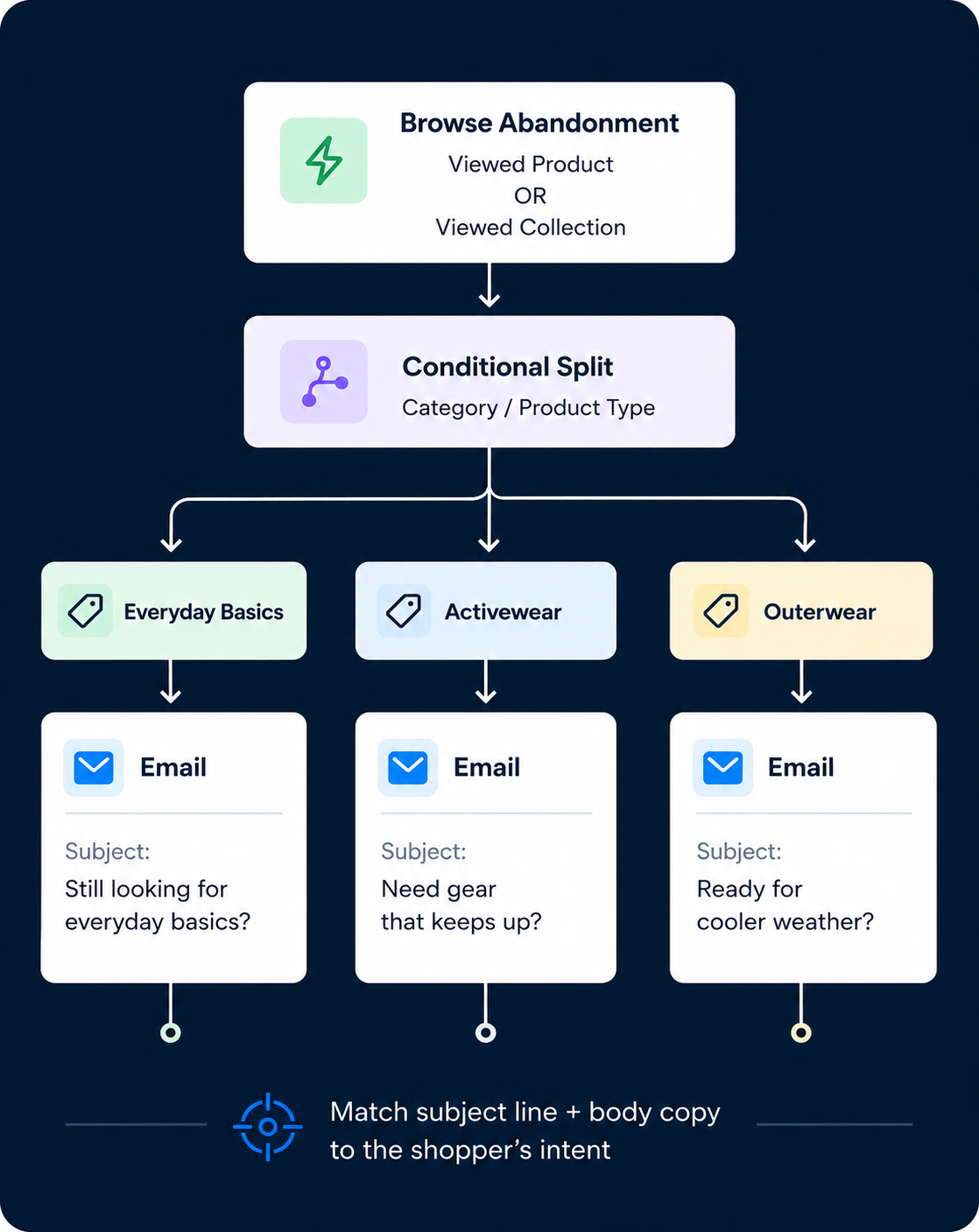
Then, in your ESP (Klaviyo, etc.):
- Trigger browse abandonment based on product or collection viewed
- Add a conditional split based on category or product type
- Match subject line + body copy to that ONE intent
Start with your top 2–3 categories and build from there.
If nothing else, just change your subject line.
Instead of:
“You left something behind”
Try:
“Still need [category]?”
“Want a better option for [use case]?”
“Looking for something more [specific benefit]?”
That redirect reframes the entire email.
When this matters most:
Browse abandonment emails catch shoppers early.
This matters most when the path to purchase takes time.
For instance, if:
- You sell a large catalog: More options = more comparison before buying.
- You sell luxury, premium products: Shoppers leave to think, then come back.
- You sell products that require education: People browse before they understand.