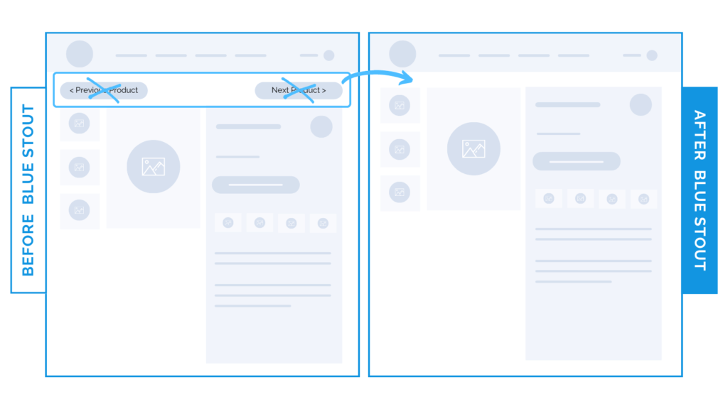
Removing THESE links on the product page leads to an 11% CVR increase.
In a recent test, we removed the “Previous Product” and “Next Product” links from the top of the product detail page, resulting in an 11.4% uplift in conversions and a 14.6% increase in Revenue Per Session (RPS).
Your product page is NOT for browsing…
…it’s for buying.
Let’s get into it.

Here’s Why it Worked
Simply removing these distracting “Previous Product” and “Next Product” links forces customers to browse with intention.
When a customer lands on a product page, they’re curious about that SINGULAR product.
Redirecting their focus to other products too soon distracts from the current product.
Our goal is to keep the customer on the page long enough to complete a purchase, not to redirect them to your other products.
The Collection pages are for browsing. Keep your product detail pages focused on just that—your product’s details and key information.
The less distracting links & lingo on your product detail pages, the better.
What Most Brands Do Wrong
Most brands don’t TEST to see how these seemingly helpful links could distract…
….and they assume when they give customers the option to view OTHER products through easy-to-see links, more purchases result.
But distractions kill follow-through.
Keep product pages focused on ONE product. It leads to faster purchases and better conversions.
Try it out:
Have previous and next links, OR links to other products prominently displayed on your product pages? Cut them.
Then, test, review, repeat.


