
Reduced header height on THIS page leads to a 15% conversion increase.
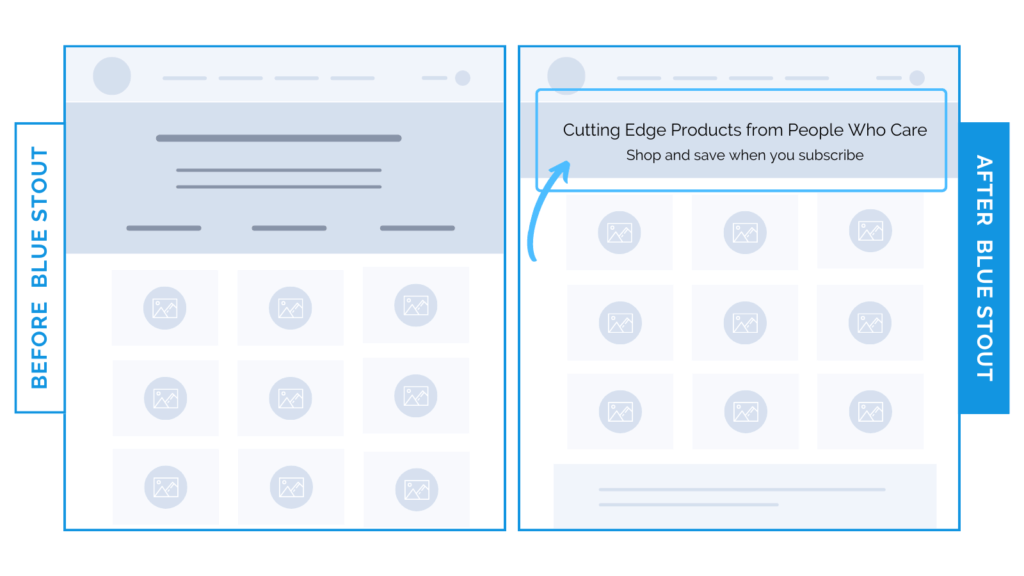
In a recent test, we reduced the height of a header section on the ‘All Products’ collection page. This simple change locked in a 15% conversion boost.
Here’s Why it Worked
The header section on the ‘All Products’ collection page is a key spot for a brand statement…
…NOT a place to take up space.
By reducing the header height, primary products are higher on the page, allowing visitors to shop right away.
When we looked at the percentage of traffic that comes to the all-products collection page, the overwhelming percentage was from the site and email.
These customers are likely already educated on the product and brand because of this.
Therefore, the need to educate on the all-products page for THIS brand is less important.
We can tell from the traffic source that visitors are more product-aware and ready to shop.
Visible products = easier sales.
What Most Brands Do Wrong
Most brands rarely analyze their audience’s awareness level and page traffic source. Instead, they assume they need to pack a ton of key information into the header every time.
If the majority of traffic is coming from “warm” sources already navigating on your site or from email, you can keep it slim and unobtrusive with clear text that’s easy to scan, so the important products are visible above the fold.
Try it out:
Check your traffic sources. Reduce the header height on your all-products collection page to show more shoppable content, if applicable to you.