Got bundles? Here’s how to show pricing for higher conversions.
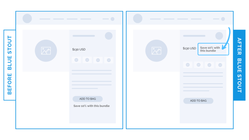
In a recent test for a bundle product, we added the savings amount NEXT TO the price and above the product description for an apparel brand. It generated a 7% increase in conversion rate.
Don’t bury the lead!
Communicating savings efficiently for bundled products can significantly impact product page conversions.

Here’s Why it Worked
Before, the savings text (“Save 10% with this bundle”) was BELOW the add to cart button. While this placement is next to the decision-making point, it loses impact this far down the page.
By adding the savings next to the price, customers know EXACTLY how much they would save when buying a bundle…
…without doing the math or scrolling for info.
What Most Brands Do Wrong
Most brands who offer a bundle either don’t communicate the amount saved at all, or state it somewhere other than right next to the price.
If there are ANY savings associated with your bundle, make sure it’s communicated as close to the price point as possible.
Try it out:
Do you offer a bundle that saves your customers’ money? Don’t bury the lead! Try moving it front and center next to your price in the Buy Box. Then, test, review, repeat.


