
We moved this HIGHER on mobile for a 13% conversion boost.
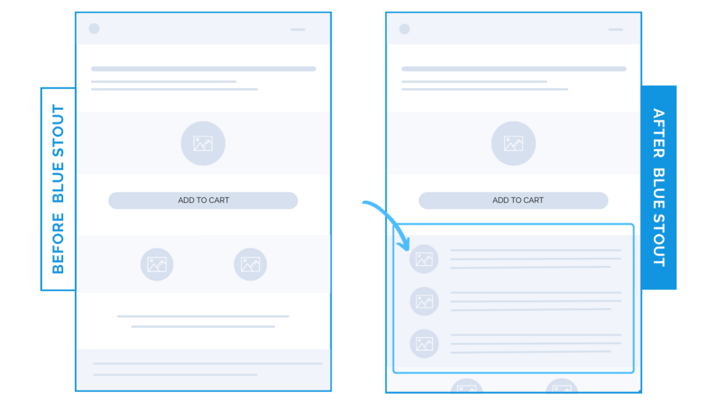
In a recent test for a supplement client, we moved a key informational section higher on the mobile product page, putting it right below the Buy Box and boosting conversions by 13%.
Here’s Why it Worked
In prior tests for this CPG brand, we learned that by removing “filler” content sections, more conversions resulted. We needed to be extra strategic for their audience of methodical shoppers by including ONLY key content and introducing it earlier.
On mobile especially, there’s limited real estate. You need to do more with less.
When we moved an informational section UP next to the Buy Box on the mobile PDP, it highlighted major brand differentiators and led to faster purchases.
Know your audience, elevate the KEY info on your product pages, and test it.
What Most Brands Do Wrong
Most brands have a list of compelling points they want to make on the product page without a strategy around their placement.
They just mimic other brands.
This is a missed opportunity. For methodical shoppers, appease them by knocking down objections, appealing to their direct needs, and tailoring their journey to make purchases easy.
The more you know your specific type of shopper, the easier it is to strategize the hierarchy of your product pages.
For this brand’s customers, an informational section higher up WORKED because it uses data to showcase exactly what sets them apart from others, based on the nutritional needs of the audience.
Highlighting their needs EARLY will help your new customer feel justified in their purchase.
Try it out:
Do you have methodical shoppers? Consider moving your product information up on mobile. Then, TEST!