Mobile vs. Desktop test: reducing clutter on your collections page
Reduce clutter, but test what you remove on desktop and mobile separately.
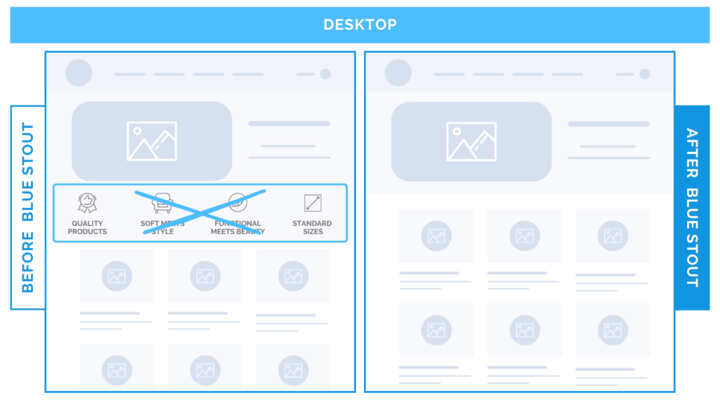
In a recent test for a home goods brand, conversions increased on desktop when we removed icons from the collection page header but kept the lifestyle image.
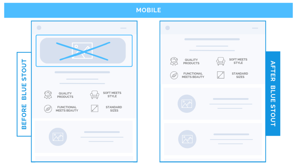
On mobile, the exact same test decreased conversions. The inverse worked: when we removed the image and saved the icons, conversions increased.


By reducing clutter and validating what works best on different screens, we maximized conversions and improved the customer experience.
Here’s Why it Worked
Be mindful of the screen your information is presented on.
Is your header adding value or slowing buyers down?
Good rule of thumb:
- For larger screens, there’s extra space to work with. More can be presented in the header without pushing important elements down the page.
- On smaller screens, space is limited. Images take over above the fold and push key information down.
On collection pages, buyers get a sense of what you offer before they are ready to view products.
While icons distracted on desktop, they worked on mobile because they presented key information about the products early on and nurtured potential buyers.
The image added interest to a larger desktop screen, but was too distracting for mobile viewers.
What Most Brands Do Wrong
Most brands don’t design and test mobile and desktop separately.
Instead, they mirror the same content on each, and end up cluttering both.
What converts well on mobile doesn’t always work on desktop and vice versa.
The key is to TEST!
Steps to Try Today
Get clarity on what converts. Test mobile and desktop separately, rid the clutter, and keep what sticks.


