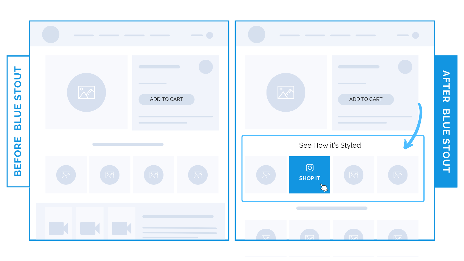
Jewelry brand’s styling section leads to 19.3% conversion increase.
Fashion brands: motivate and inspire with a styling section high on your product page.
Emotions drive purchases. Especially for personal taste products, like jewelry.
Recently, one of our luxury jewelry brands saw a 19% conversion boost when we moved a, “See how it’s styled” section of images up the page under the product buy box.
Before, it was buried near the footer.
Doing so put it above a video, and landed it next to the add-to-cart (ATC) button.

Paint a picture of a sophisticated and elevated life with images of the product, styled.
⭐ Make it easy for customers to visualize wearing your pieces before they buy.
Suddenly, they are not just pieces of jewelry; they become catalysts for their personal dreams and aspirations.
A styled section higher on the page ensures more people see it and take action.
Bonus: it’s a great way to show your whole catalog. Add an upsell section below to complete their look, and you’re off to the races.


