
Removing a color swatch added 6.6% in conversions for our fashion brand.
How removing a color swatch lifted conversions for a fashion brand.
Large catalogs are a lot to manage.
It’s tempting to use one “template” design for all products.
But, what happens when elements intended to help the customer (like color swatches) end up distracting them?
They bounce.
What’s harmless to you could cause a furrowed brow for your buyer.
Avoid unnecessary friction.
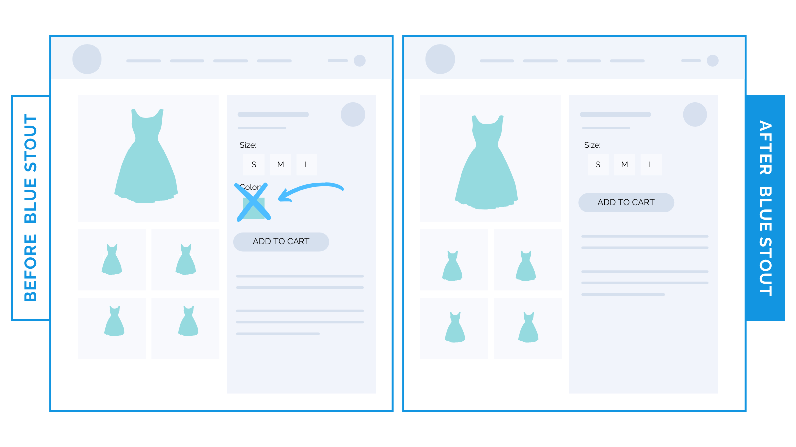
Here’s an example: for an 8-figure fashion brand, we tested removing the color swatch on products that come in just one color.
Conversions lifted by 6.6%.
That’s HUGE for a large brand.
The swatch added noise, complexity, and pushed the ATC button further down.
An image that already existed in the gallery showed the one color available, so there was no need for a color selector.
Takeaway: as tempting as it is, don’t just use one template for the whole catalog.
When there’s only one color available for a product, remove the swatch and selector to eliminate a decision point for your visitors.
Removing swatches for products available in one color does two things:
Gives visitors less information to process (and fewer decisions to make).
Lifts the add-to-cart button higher on the page (and impulse buys increase).
Action item: Sift through your product pages. Do your single products have a color swatch? Consider removing it. See what happens.