
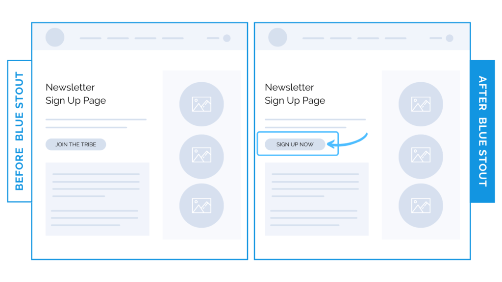
Email sign-up WIN: we changed these three words & our client saw a 59% boost in conversions.
Check it out: all we did was change the CTA button on a client’s newsletter subscription page from ‘JOIN THE TRIBE’ to ‘SIGN UP NOW’ and it resulted in a 59% boost in conversions.
Building community around your product is a delicate art, and your newsletter sign-up page is a HUGE asset to your sales. But: it can turn your customers away in a split second if you’re not careful.
Your copy should solve problems. Be as direct as you can, and for the love of conversions:
❗Remove friction & fluff❗
…especially when asking your customer to make moves.
Keep your call-to-action VERY underwhelming and actionable.
Why it Worked
Direct CTAs = anxiety reduction = more traffic.
The clearer you are on your email sign-up page, the less risk your customer is taking on, which increases the flow to purchase and instills major trust points.
The takeaway?
Don’t play with trendy language. Remove the excess. Solve their problems with your content, and make it easy to take that next step.
What Most Brands Do Wrong
Most brands underestimate the power of email subscription pages in general, and the language that will get their customer in the door. Make sure your copy speaks to their immediate desires.
Try it out:
Take a look at your CTA copy. Make it direct and to the point, and show them your personality later.