
Moving key info BELOW the add-to-cart button saw a 25% conversion boost and more money for our high-end apparel client.
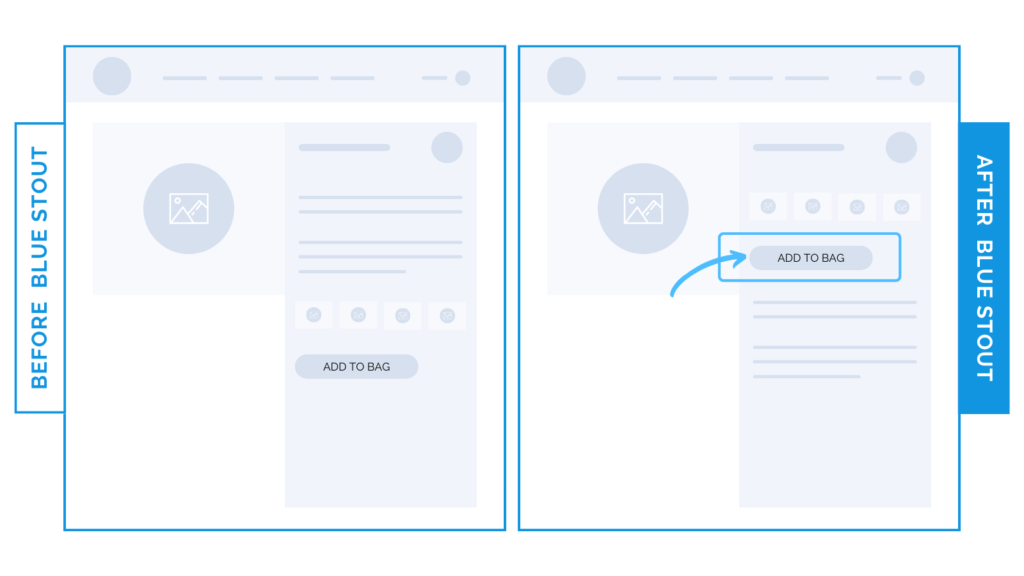
In a recent test, moving the add-to-cart button HIGHER UP on the product page for our footwear client resulted in a conversion boost of 25%.
Customers love a streamlined experience.
Don’t make them scroll to make a purchase.
Why it Worked
Critical information is key to making an informed purchase. When it comes to selling expensive apparel, your customer wants to know WHY it’s worth the price tag. But does it sometimes distract?
Yup. Sure can.
For this footwear brand selling internationally, their elevated, high-quality, on-trend shoes are popular and lasting, and they have many colorways to choose from.
Before, the full-text description was above the add-to-cart button.
Our new layout moved this add-to-cart button above the description and it saw a 25% boost in conversions.
What Most Brands Do Wrong
Know your target customer. Most brands assume that adding a description directly above the add-to-cart button will tug at their emotions, and convince the user to buy.
But for some, it interrupts the purchase flow and distracts from the actual product and visuals – especially for an apparel brand.
Try it out:
Move info BELOW the ATC button next time and see what happens to your conversion rate.