
Keep your navigation menu SUPER clear. Category header tip inside.
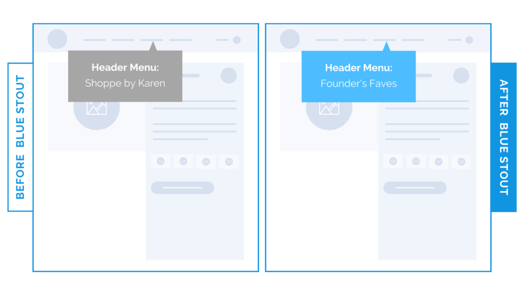
Category header tip: one of our clients had a drop-down link on their header menu that read, ‘Shoppe by Karen’ to indicate the founder’s favorite picks. But in a recent test, we changed this category header to say ‘Founder’s Faves’ – a direct mention of what is in the collection – and dropped the name for an uplift in conversions.
‘Founder’s Faves’ is much more specific to what the customer is looking for:
Why it Worked
If every element isn’t communicated as simply as possible, confusion sets in.
…and customers will bounce.
Clarity = conversion. ?
Tell people exactly what to expect!
This particular client sells baby clothing and goods, so it’s helpful for the customer to know the founder’s suggestions for what a new mom might need, without surfing through the full site.
Clear headers make it easy to see recommendations, which keeps the path clear for customers.
Be Clear in Navigation
Empathize with your customer and understand what THEY think about upon arrival at your site.
Chances are high that your customer doesn’t know, or care, who your founder is.
They DO want to know what they should buy, and if your founder is an authority, use it.
But don’t get too specific with an actual name.
On your navigation menu, keep it direct and tell them exactly what they’re getting in the dropdown.
Then, TEST!
Try it out:
Check out your navigation menu category headers. Do they make it simple and easy for your customer to understand what they’ll get when they take action?