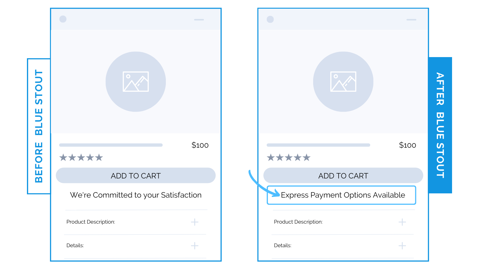
Fashion brand wins mobile conversions with “Express Checkout Options” message in cart page.
For a luxury fashion brand, highlighting express payment options increases conversions on mobile.
Your add-to-cart messaging is a critical part of the purchase process. Make it persuasive.
Before, the message “We’re Committed to your Satisfaction” was listed by the add-to-cart button on a jewelry brand’s product page.
Instead, we tested two new variations:
- “Express Payment Options Available”
- “Free Shipping For Orders $150+”
Each contributed to a higher Average Order Value (AOV), but mobile traffic saw the highest conversion increase with the first option under the add-to-cart button.

Here’s Why it Worked
Convenience is bliss. Use it to your advantage.
A Satisfaction Commitment is a great sentiment. But, right next to the add-to-cart button may not be the most impactful place for it.
Offer them speed and ease instead.
With express payment, there is zero friction. A product like jewelry is a personal decision backed by emotions. If it’s easy to checkout, it’s easy to follow through on their emotional decision.
Express payment = less work for customers.
What Most Brands Do Wrong
Most brands recognize the power of persuasive messages next to the add-to-cart button.
But, most don’t TEST to see what variation works best for their audience on mobile vs. desktop.
Remember: your commitment to your customers (“Satisfaction Guaranteed”) is not a compelling enough reason for them to make a purchase.
Instead, highlight value-added features like Express Payment Options and Free Shipping to impact the convenience and speed of their purchasing process.
Steps to Try Today
Do you have a message next to your add-to-cart button on product pages?
Follow these pointers:
- Highlight your most valuable incentives
- Ensure that your message is optimized for mobile devices
- Rotate your messaging themes
Then, make sure to test!


