
Luxury jewelry brand homepage conversions increase with solid-fill CTA button.
Ensure the most important next step for your customer is visible in your design.
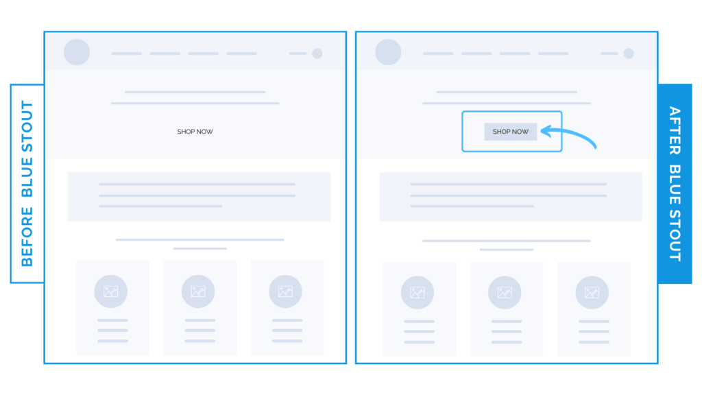
On a luxury fashion brand’s homepage, conversions increased when we used a solid-fill style on the main call-to-action button instead of a transparent button placed on the header image.
By simply filling in the button, we added 6-figures of revenue over 6 months.
When CTA buttons are transparent, customers may miss them as they view the busy hero image.
Make the most important call-to-action visible in your homepage header.
Here’s Why it Worked
You can optimize for conversions AND have a sleek look.
Don’t stack the odds against your buyer – design your homepage so their next step is clear.
Filling in the button in the header worked because customers were able to see what next step they should take to learn more.
Before the change, the hero image was distracting from the CTA button.
What Most Brands Do Wrong
Many luxury brands soften call-to-action buttons to blend into their design.
This isn’t doing the customer any favors.
Potential buyers want to be directed to learn more about your product.
Make it obvious how to do so by having your call-to-action clearly outlined!
You can be direct and still have an elevated and clear design.
Steps to Try Today
Do you have a call-to-action button that blends in? Consider filling it with a highly contrasted color or outline to make it visible to your buyer right away.