
Traditional product page buy box design wins conversions for luxury brand
Even designer brands require a traditional product page layout.
When designing a mobile-friendly site, it’s easy to overlook how important an intuitive shopping experience is – that is, one where your customer knows exactly what to do next.
One of our designer brands created its product page to be an ultra-specific brand experience that was difficult to navigate.
To make it more intuitive, we switched it to a more traditional layout.
It led to a 23.4% increase in conversions for their top-selling product.
When in doubt, choose the site experience that feels easy to navigate.
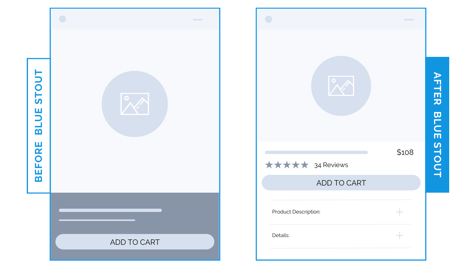
Here’s Why it Worked
Our new design presented copy early on the product page, leaving room for an emotional connection to occur.
No digging for details here.
The less information you show, the more searching buyers have to do to get what they need to feel good about a purchase.
Stick to a traditional design on product pages for an easy buying experience.
What Most Brands Do Wrong
Many designer brands build a layout that is unusual and foreign to capture their brand’s essence and personality.
BUT, they fail to consider how difficult it can be to navigate.
If you design a non-traditional layout that makes it tough to find information to the questions customers are asking, you could lose tons of buyers.
Remember: if they can’t intuitively navigate it, it’s not worth it!
Steps to Try Today
Do you have a unique design on product pages? Consider switching it up to a more traditional layout. Then, test!