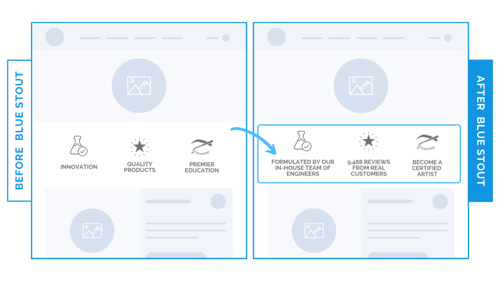
A beauty brand’s benefits were vaguely stated. We made them more specific and homepage conversions increased by 6%
You have seconds to capture the attention of an overstimulated customer.
Make them count.
In a recent test, we added additional clarity to a beauty brand’s key selling points. This increased conversions by 6% with a 3% decline in bounce rate.

Here’s Why it Worked
Despite looking great, the previous icons stated vague benefits. We made them more specific.
Before:
- Innovation
- Quality Products
- Premier Education
After:
- Formulated by our in-house team of engineers
- 9,488 reviews from real customers
- Become a certified artist
See the difference?
Overall, conversions increased because:
- Specific selling points grab attention.
- Real data differentiates the brand in a quick glance.
- Power phrases spark curiosity.
What Most Brands Do Wrong
Most brands use filler words that fail to inspire scrolls, or they try to be clever.
People make purchases based on two needs:
- Do I want to buy what you’re selling?
- Do I trust you?
To meet these 2 needs, brand benefits must be clear and specific.
Steps to Implement Today
Is your brand copy lacking clarity?
Keep it clear and specific.


