
Debunking 3 common best practices in fashion site design.
Best practices used by most agencies and experts may be a good starting point.
But they’re rarely a surefire thing.
Know thy audience instead of mimicking others’ methods.
Here’s what happened when we challenged 3 common best practices for apparel brands:
Best practice debunk #1: Keep your cart streamlined 🚫
Most say your cart design should be clean, simple, and void of distraction.
But, more content can be a revenue driver (if it’s near the point of purchase).
When we added a second upsell slider of curated product recs, RPU increased by 24% increase for our apparel brand.
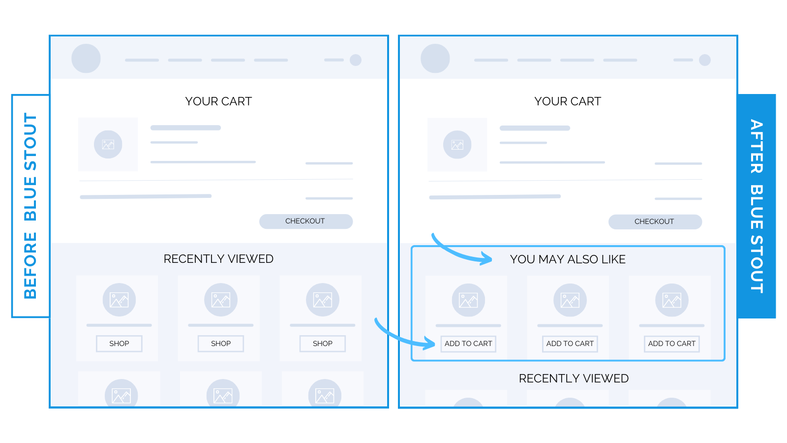
If you have a lot of products, varying your upsells is a great idea.
Here, it worked because customers are getting two upsell opportunities at once:
- Custom recommendations based on what’s already in their cart using the Rebuy app.
- Previously viewed items that they’ve already shown interest in.
This way, they’re discovering products they haven’t seen before in a quick glance close to the point of purchase.
Best practice debunk #2: Apparel brands’ sites should be imagery focused 🚫
Most fashion brands think: the less text, the better. Shouldn’t product photos hold more value?
Not necessarily.
Think twice before burying details behind a “luxury” design.
In a recent test, we expanded product info on the page from a closed section that had to be clicked open to read.
This brought a 20.3% lift in conversions on mobile and desktop for a handbag brand.
Most visitors don’t want to click a hidden box to answer their questions.
Eliminate friction and keep important info easy to consume.
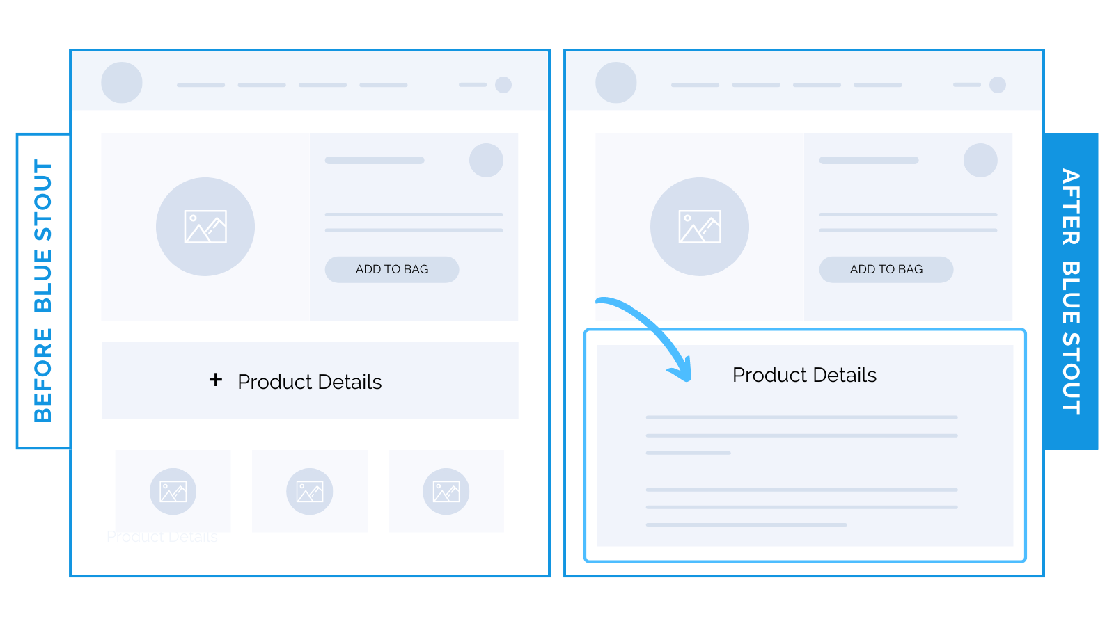
By expanding the product details onto the page, we also avoid issues on smaller screens.
The opened version of the collapsed description could create friction in adding to the cart.
Best practice debunk #3: Use creative video to differentiate your brand 🚫
Spoiler alert: not always.
We removed a lifestyle video on our apparel client’s homepage and conversions lifted 41.8%.
While the video looked cool, it didn’t convey user benefits, add to the brand story, or provide anything that would contribute to the customer purchasing the product.
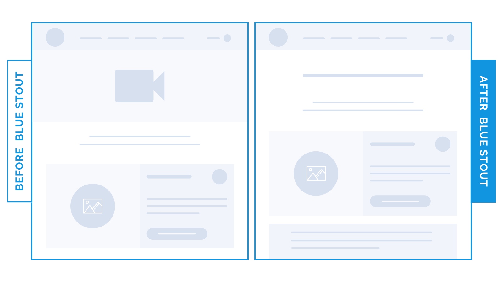
Eliminating this distracting video element right away keeps visitors focused on the product, and scrolling further to get the information they need.
You can’t afford to add fluff.