
Removing visual barriers on product page leads to 29% CVR rise
Remove visual obstructions on the product page that halt customer flow.
We changed the color of an icon bar from black to white on the PDP to make it less obtrusive. This led to a whopping 29% rise in conversions.
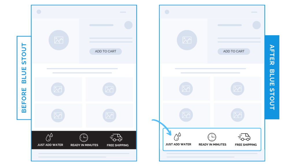
Before, customers may have thought the black bar was the footer and thus, the end of the product page.
Instead, a white background with black icons opens up the page to encourage further scrolling.
Here’s Why it Worked
Don’t interrupt customer flow on the product page.
Design elements that look like barriers confuse your customer and lead to early bounces, especially on mobile screens.
A dark icon bar ended up looking like the end of the page when it was far from it.
When visual barriers are removed, it allows more opportunities to sell your customer and get their questions answered below the page fold.
What Most Brands Do Wrong
Most brands don’t realize when their design elements look like the end of a page – whether banners, boxes, or notification bars.
No matter how significant the info displayed in these designs, if it looks visually obstructive, you’re losing people.
Design with flow in mind so they don’t miss your most important product information.
Steps to Try Today
Are there any obstructions on your product page that could interrupt your customers?
Look out for designs that are visually obstructive and switch up these elements for a smooth customer journey.