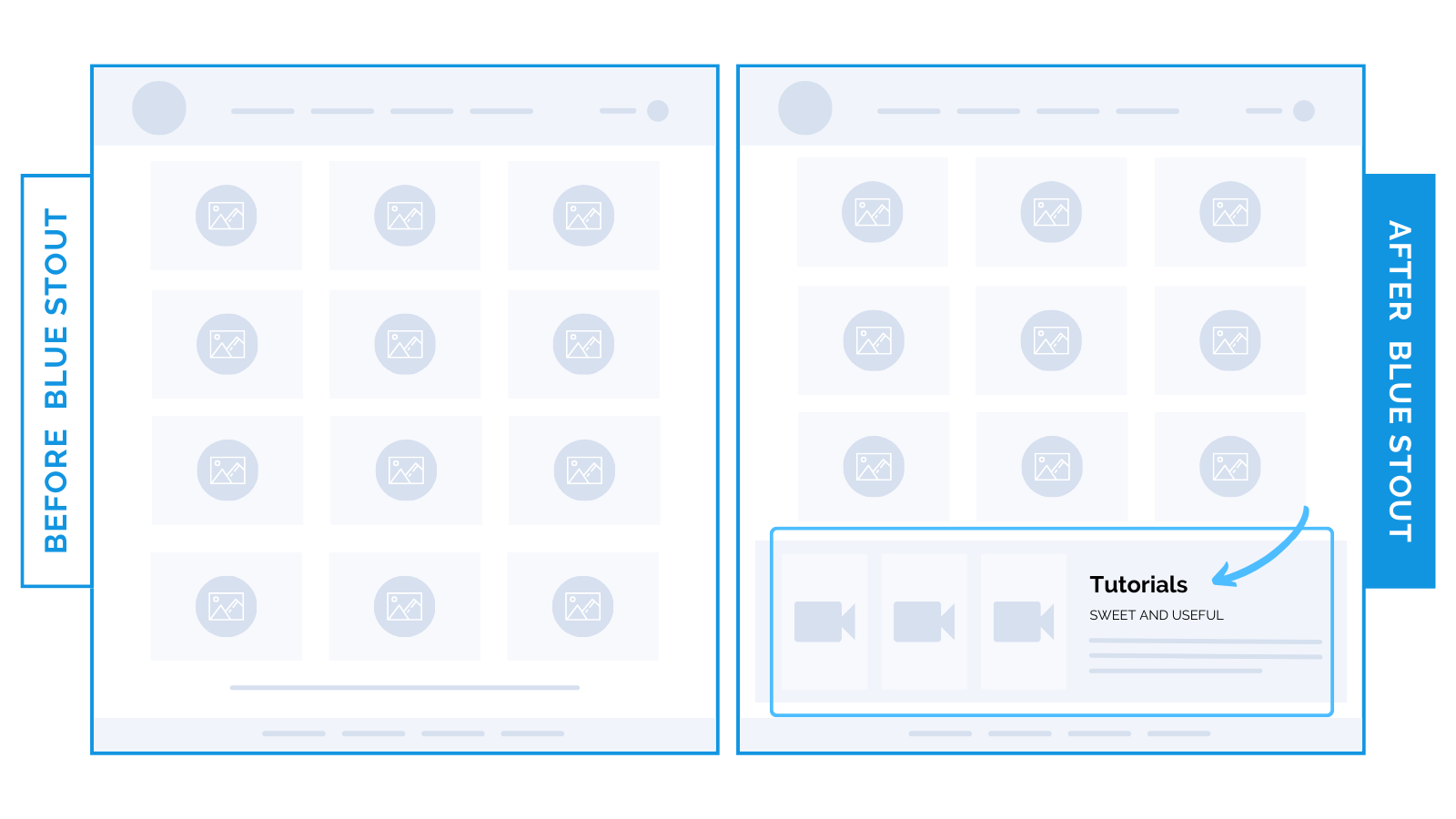
Tutorial highlights on collections pages increase conversions for apparel brand.
Use tutorials to enhance product understanding on Collections pages.
Our client, an infant apparel brand with a diverse product catalog, faced a challenge.
Their products were complex enough that customers (especially first-time parents or gifters) could feel overwhelmed.
To address this, we placed tutorials at the end of the Collections page in addition to the homepage, resulting in a 3.7% overall increase in conversions.

Here’s Why it Worked
Tutorials on the Collections page did 3 things:
- Reduced anxiety: Tutorials alleviate anxiety and uncertainty for products that require know-how. This was key for this niche category, where buyers need reassurance about ease of use and safety.
- Empowered with knowledge: Simple instructions provide immediate value, increase interest, and demystify product usage, leading to more confident purchases.
- Targeted gifters: With the holiday season still in swing, tutorials were crucial for gift-givers who may not be as familiar with infant products as parents are.
What Most Brands Do Wrong
For products with a learning curve, information at each touchpoint is huge for customer understanding.
Often, too much focus is placed on the homepage. Many brands overlook the Collections page as a platform for educating and engaging.
Extending instructional content to the Collections page (only one click away from the product pages) makes it seamless for buyers to complete purchases with confidence.
Steps to Try Today
First, evaluate your product’s complexity. Could it benefit from explanations or tutorials?
Try adding informational highlights via video or slides to the Collections page.
As always, test!


