This desktop improvement hurt mobile sales. Why?
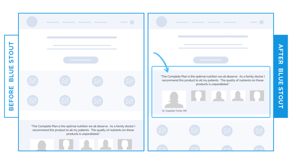
In a recent test, we saw a 13.7% uplift in conversions on desktop only when we moved reviews further up on a client’s homepage. BUT on mobile, the exact same test decreased conversions.
Why?
Your homepage is the sweet spot of your story.
Make sure that your content is positioned to keep your important info top-of-mind and your customer interested and scrolling. This looks different on mobile and desktop!

Why it Worked
The test worked WELL on desktop because more social proof is visible at one time on screen, whereas the mobile layout shows just one at a time.
In addition, when reviews were moved up on mobile, it pushed the higher priority content (like product info) further down the page.
The desktop design shows social proof validation with product info directly above and visible.
Your customer wants to know that the product is healthy, safe, and works.
If high-quality sources vouch for it? They want it, too. And stat.
Show this social proof early on the desktop homepage. But, be mindful on mobile.
What Most Brands Do Wrong
Most brands overlook the difference between desktop and mobile and keep their designs the same without considering how minor differences could elevate conversions in a big way.
Don’t be like them.
Instead: try moving social proof up on your desktop homepage and not mobile. Watch your conversion rate shift.
Try it out:
Move your reviews higher up on your homepage and then TEST! Experiment with other elements, like keeping the same layout on mobile, or switching it up.


