
We REMOVED this popular feature on the homepage & conversions improved by 41.8%
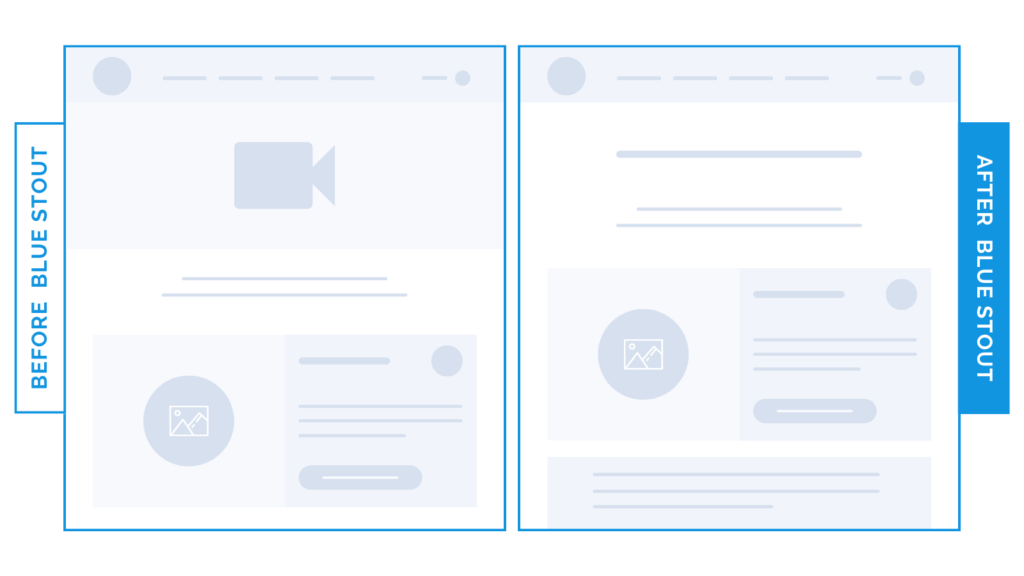
In a recent test, we removed a video on our apparel client’s homepage, and it boosted conversions by 41.8%.
While the video looked cool, it didn’t convey any user benefits, add to the brand story, or provide something that would contribute to the customer purchasing the product.
When it comes to your homepage, make sure each element of your UX design leads your customer exactly where they need to go. You can’t afford to add fluff here.
Here’s Why it Worked
Removing this pretty but distracting video element right away keeps visitors focused on the product, and scrolling further to get the information they need.
What Most Brands Do Wrong
Most brands think you have to share EVERY element of the user experience on your homepage, or you’ll lose people. This is not the case.
The less elements you have here (but well-intentioned and tested) the better.
Get creative and use video on another page or platform instead.
Share videos of your products in action on your about page or social media, either in reel form on your main feed, in ads with supportive and descriptive copy, or on stories. It’s interactive, eye-catching, and lifestyle-focused.
Keep your homepage focused on the facts, CTAs that intrigue, and UX that flows to the next stage with ease.
Try it out:
Have video on your site? Remove it and move up important elements that help the users understand what they’re getting. Test, review, repeat.