
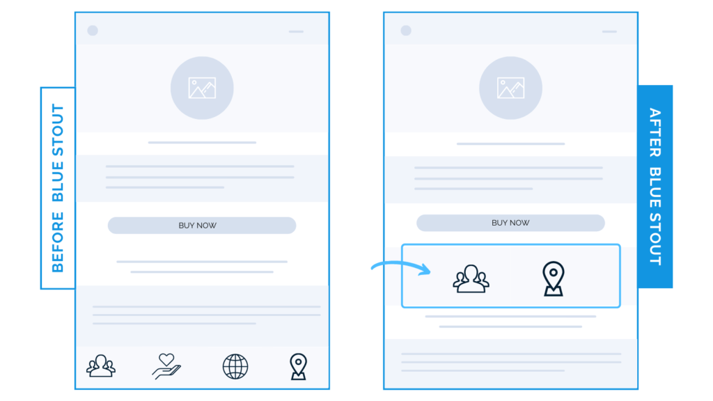
Moving 2 icons increased mobile conversions by 23.5%
Check this out:
In a recent test for one of our client’s product pages, we moved 2 out of 4 benefit icons from lower on the page to higher up below the buy box. It generated an uplift of 23.5% on mobile (!)
Why it Worked
In the fast-paced mobile-heavy world of e-commerce, visitors are scanning for the information they need. You want to make sure that your product benefits (not features) are quick, digestible statements, and easy to scan to encourage scroll depth.
It’s a delicate balance. If your important icons take up TOO much space, they’ll impede on scroll. In this test, we split four of them up: two right below the buy box, and the remaining two lower on the page.
Overall, conversions increased because these quick statements deliver key messages above-the-fold.
Your job in this top section of the product detail page is to escort the ready-to-buy prospect to the cart.
This means that your imagery, icons, and copy should be easy to spot & include a believable promise that your product will fulfill their needs before they scroll the page.
Sure enough, desktop performance declined during this test, as the larger screen sizes favor greater amounts of copy than the simple icons. On mobile, it’s the opposite.
To recap, test this:
Don’t interrupt scrolling with a clutter of iconography. Test moving two of your product benefit icons right below your ATC button, and make sure copy is short, punchy, and clear to increase motivation to buy.