





The retention opportunity hiding on your unsubscribe page
Your unsubscribe page might be one of the most overlooked retention tools in your email program.
When someone clicks unsubscribe, they’re telling you something isn’t working.
Maybe the frequency is too high.
Or they’re only interested in sales.
They could love your products, but not want every email.
The mistake is assuming the only solution is to leave.
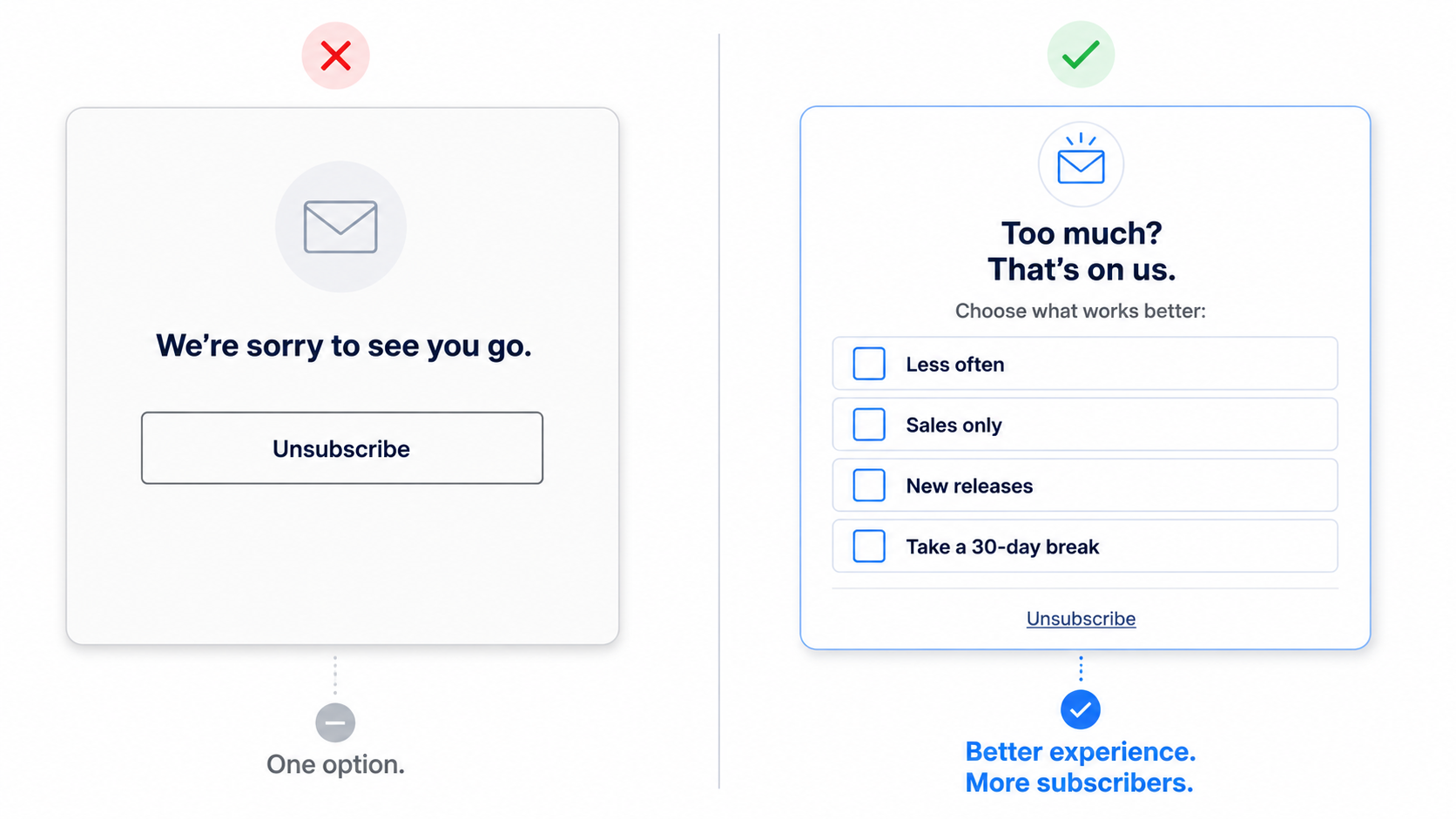
Standard:
Unsubscribe from our emails.
Better:
Maybe you don’t hate us. Maybe you just hate a cluttered inbox.
Let’s fix that:
☐ Send me fewer emails
☐ Sales only, please
☐ Show me the new products
☐ Take a 30-day break
Even simpler:
Too much?
That’s on us.
Choose what works better:
☐ Less often
☐ Sales only
☐ New releases only
☐ Take a break
Or this scenario we see everywhere…
Standard:
We’re sorry to see you go.
Boring.
Instead, try:
Not interested in every drop?
We’ll save you a seat for the big ones.
☐ Major launches
☐ Sale alerts only
☐ Monthly roundup
☐ Unsubscribe
Many brands make the mistake of trying to convince when they need to let subscribers find their own version that works for them.
The feedback you receive from these is priceless.
Action Item:
Click your own unsubscribe link in your email.
Does it let subscribers adjust frequency, choose content, pause emails, or join SMS instead of leaving altogether?
If not, get creative (see above).
Then test.