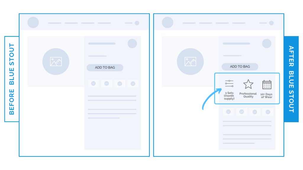
Selling propositions directly next to THIS button adds an 11% conversion boost.
In a recent test, we put a brand’s Unique Selling Propositions directly next to the ATC button, and it boosted conversions by 11%.
Don’t be afraid to repeat your brand’s easy-to-scan value propositions where it counts!

Here’s Why it Worked
Adding the brand’s top three benefit icons below the add-to-cart button reminds customers at the point of purchase WHY they should buy.
Put your key info where they decide.
What Most Brands Do Wrong
Most brands refrain from thoughtfully repeating their top value propositions and product benefits. You can still keep the buyer experience clean and focused while testing what works.
Try it out:
Are your brand values working FOR you? Try adding your top three next to the ATC button. Then, test, review, repeat.


