
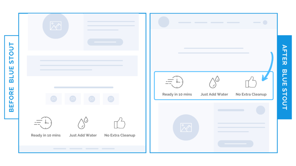
Benefits icons on the homepage added a 13% lift to conversions
In a recent test, we moved a row of unique value proposition icons HIGHER on the homepage. This simple shift in location lifted conversions by 13%.
The lesson?
SMALL tweaks can make a BIG impact. And customers care about BENEFITS.
Here’s Why it Worked
We noticed this brand’s icons were low on the homepage, and practically invisible to those just landing there for the first time.
This is a lost opportunity to make an impact.
Conversions increased because we delivered KEY product benefits to new customers right away on the top of the homepage.
Visitors are always scanning for the information they need, especially on mobile.
Make your unique value propositions short, believable, and inspiring phrases that speak to cross-category benefits, and put them above the fold.
These value icons specifically hit on the speed, simplicity, and time-savings of this food brand’s products…
“Ready in 10 mins”
“Just Add Water”
“No Extra Cleanup”
…which inspires scroll-depth, browsing, and eventual purchases.
What Most Brands Do Wrong
Most brands assume customers already know their benefits. So, they overlook the simplicity of just making those benefits EASIER to see and find upon first visit.
Try it out:
Are your value statements quick-to-scan, punchy, and clear? If so, try optimizing their placement above the fold on the homepage. Test, review, repeat.