
Product page redesign for designer fashion brand lifts conversions 23.4%
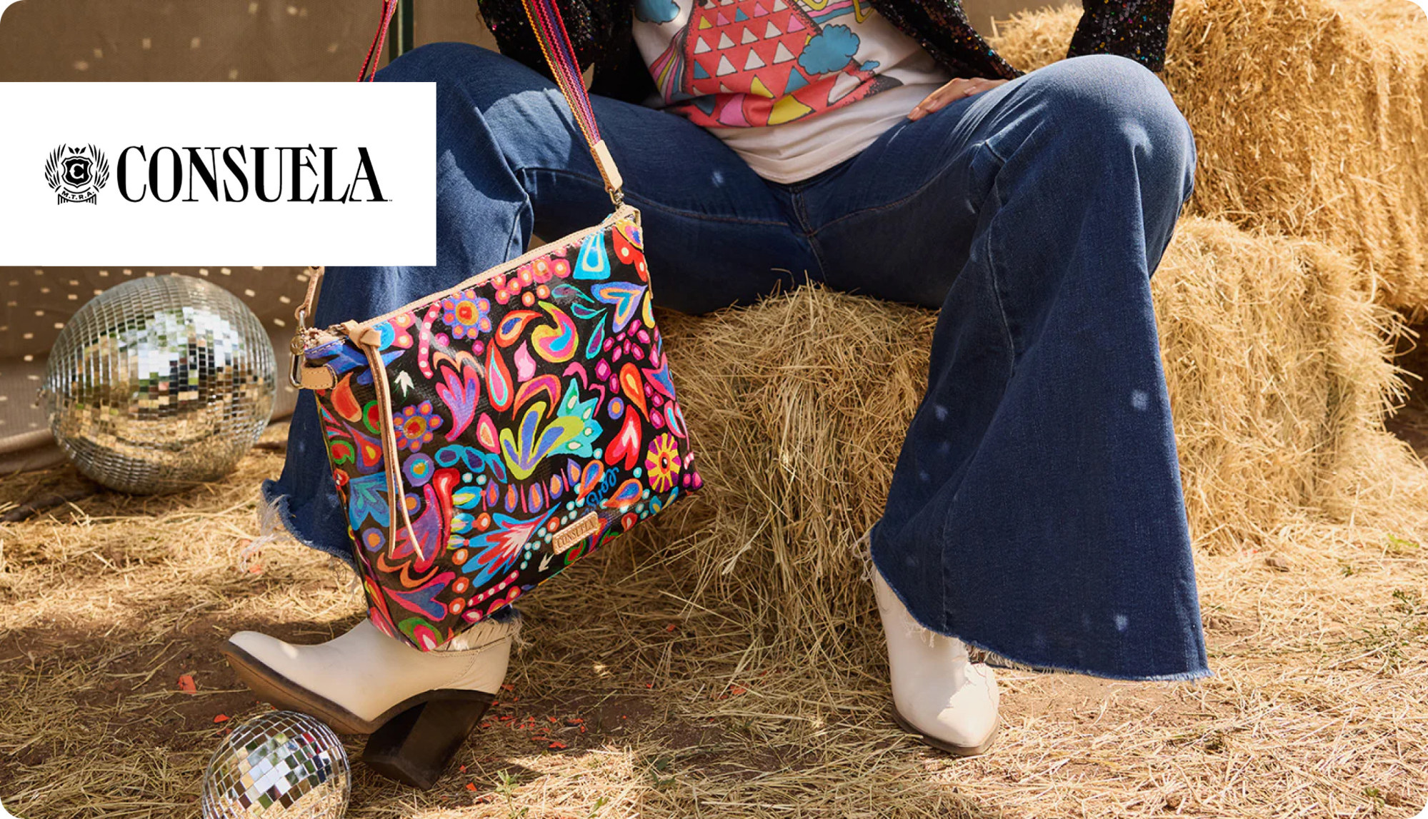
Today, we’re looking at Consuela Style, a fashion brand out of Austin, Texas.
The team’s artists from the US and Mexico design bags with self-expression in mind. Contrasting colors, textures, and prints make them (and their loyal following) stand out.
They launched a product page that was an ultra-specific brand experience that matched their products and reflected their energy and values.
The only issue: although beautiful, it was not an intuitive shopping experience.
We saw an opportunity to take their unique layout and display it in a way that felt more familiar to a buyer.
Our end goal? Create a mobile-friendly, intuitive shopping experience that still feels on-brand.
We turned a super-specific design into a user-friendly layout to unlock 23.4% increase in conversions for their top-selling product.
Here’s the thing: you can maintain designer integrity and a specific brand image while still producing a page layout that’s easy to navigate.
Traditional doesn’t have to be boring!
Fashion brands tend to prioritize aesthetics over accessibility.
This often translates to unusual layouts that add unnecessary friction to a purchase.
Many think that collapsing product info in the Buy Box will allow them to feature more design, imagery, and video, and reduce the clutter of text.
The problem?
Customers will not be confident in their purchase without the information they need readily available.
Handbag shoppers want to know size, material, and functionality – clear, upfront information makes for quick decisions.
For Consuela Style, key “Buy Box” info was hidden in a bright yellow box that scrolled the page as visitors did:
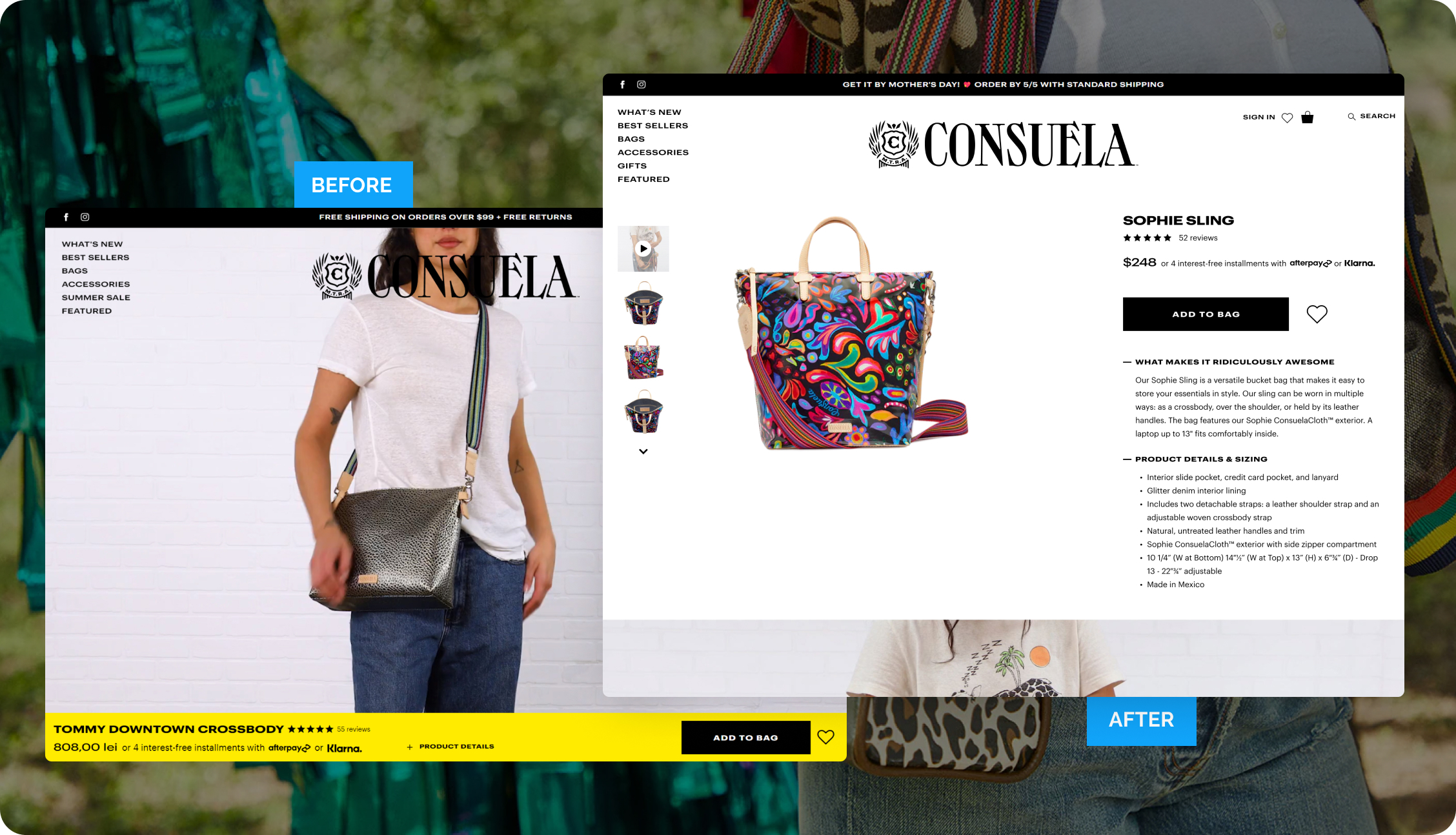
Hiding details in expandable sections makes it tough to easily scan, and reduces impulse purchases.
We updated the entire “Buy Box” experience to make this info visible:
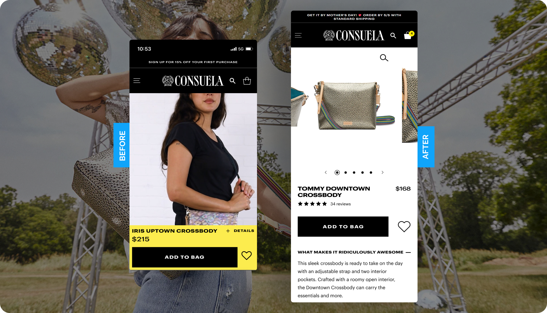
Top 3 Design Updates:
- We placed info directly on the page instead of collapsing it to reduce friction and decision-making.
No bold contrasts. We used only black & white for easy reading and scanning. - No bold contrasts. We used only black & white for easy reading and scanning.
- Sales copy was moved to the top of the page to inspire an early emotional connection.
The new “traditional” design still maintains the brand’s integrity, with an easy-to-navigate, luxury feel.
This total reboot of the product page resulted in a 23% lift in conversions on mobile for their top-selling product.
Keep it simple. Your customers will thank you.

“The Blue Stout team has been an exceptional optimization and development partner. I always look forward to talking through the data and leveraging the learning it yields. They’re a great team and passionate about their work.”
Matt Ballard
President | Consuela Style