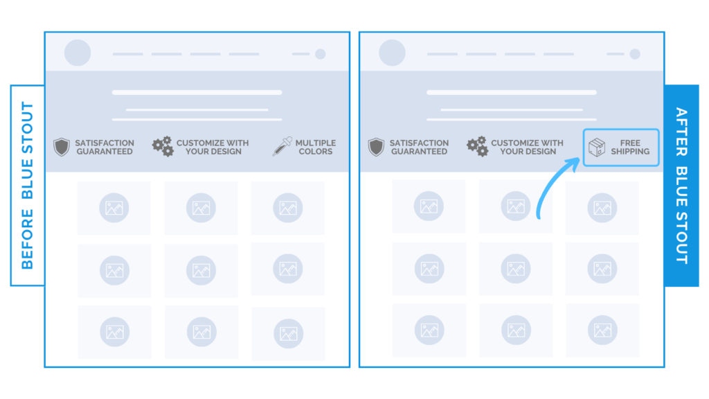
Draw attention to KEY messages and boost conversions 39%
In a recent test, we saw a 39% uplift in conversions when we replaced a client’s value proposition icon on their Collections page with FREE SHIPPING.
This client specializes in designing products in a niche market where lots of customization occurs. We decided to replace ‘Available in Color’ page with ‘Free Shipping,’ since there were 3 other icons that featured product-specific copy already…
…and it totally worked. ?

Here’s Why it Worked
Don’t exclude free shipping or other major incentives because they seem obvious.
This test worked well because free shipping is KEY when it comes to large items in a custom market. Extra shipping cost is something that could immediately tip the scales on their decision to purchase.
This promo in place of a value proposition icon allows the customer to retain interest, scroll to the good stuff…
… and eventually hit that add to cart button.
What Most Brands Do Wrong
Most brands list their product’s key assets with icons and forget that they can use this space to hint at other promotions, like free shipping, satisfaction guaranteed, etc.
Try it out:
Switch it up! Add a promo message in your icon lineup & watch those conversions increase.


