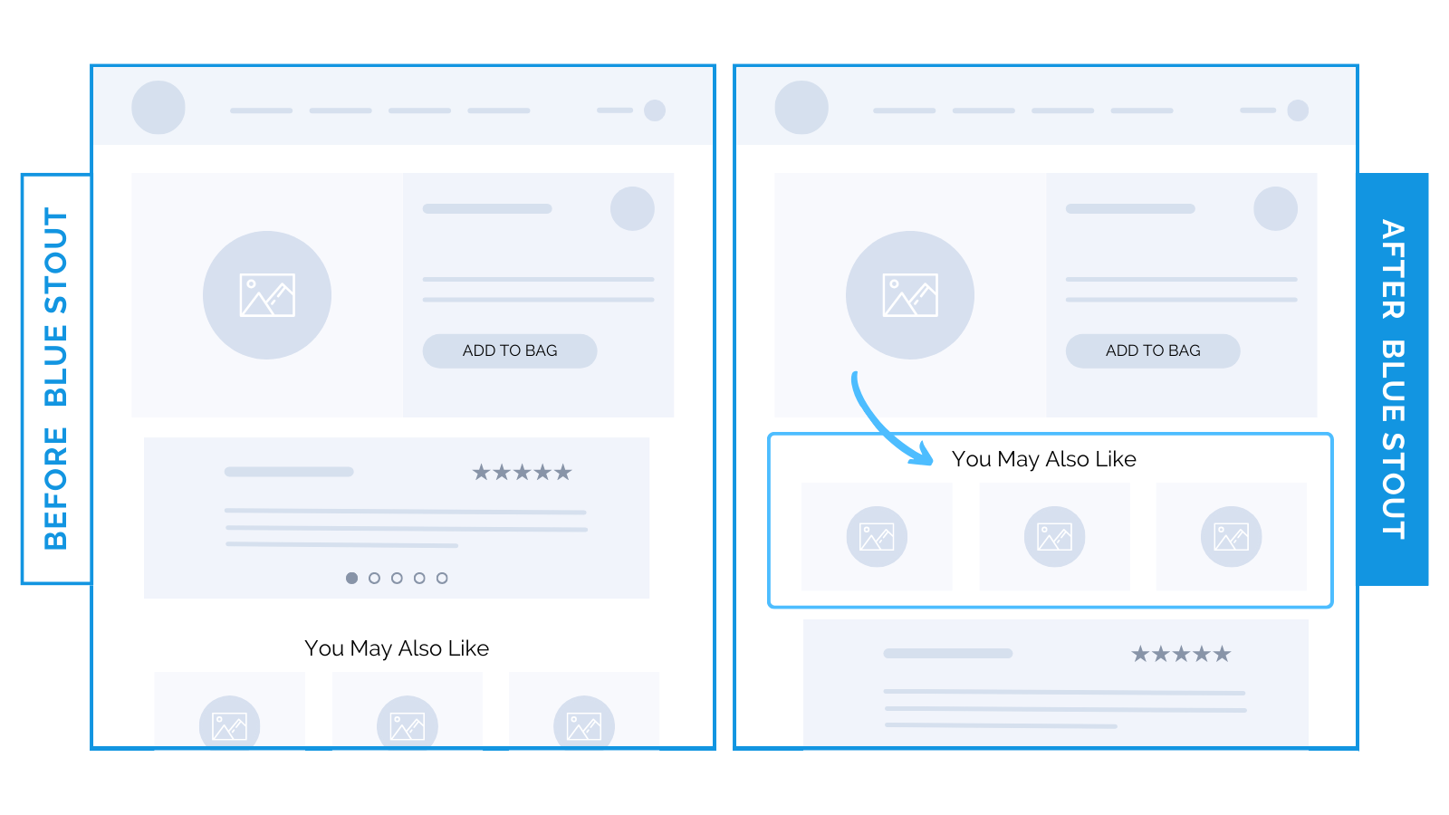
Fashion brand prioritized product recs over reviews for a conversion boost.
For fashion brands, prioritize product recs and deprioritize social proof on the product page for a better browsing experience.
Buying apparel & jewelry is a very personal choice. One that requires extra browsing to find the right product just for you.
Make sure your site design facilitates QUICKER access to MORE products, enabling customers to browse more.
When we moved a, ‘You May Also Like’ recommendation section above reviews for a luxury jewelry brand, conversions increased.
Showing alternative product options early on the product page helps to facilitate a faster purchase decision, while reviews offer validation.

Here’s Why it Worked
People buy with emotion and justify with logic.
Catch their attention, then silence their objections.
For fashion brands, while reviews substantiate the quality of an item and validate a decision, they’re not helpful for the initial product selection.
Placing product recs before reviews worked for this jewelry brand because more options mean a more personalized browsing experience.
Make it easy for buyers to discover the right product for them (especially if you have a large catalog).
A formula:
- First, showcase many options so buyers choose a product to purchase with confidence.
- Then, silence their objections with logic. Once they decide a specific product is right for them, reviews and social proof offer validation and answer questions.
What Most Brands Do Wrong
Many fashion brands prioritize social proof too high up the page.
No need to validate your product before the personal decision to purchase is made.
Allow buyers ample time to browse. Only then should they scroll to social proof.
Steps to Try Today
Do you have product reviews high on your product pages?
Consider putting product recommendations in their place, and move reviews lower.
Then, test!


