
How a navigation menu lifts conversions by 29% using real data.
Use your customer data to curate a navigation menu that directs customers to the highest revenue pages faster.
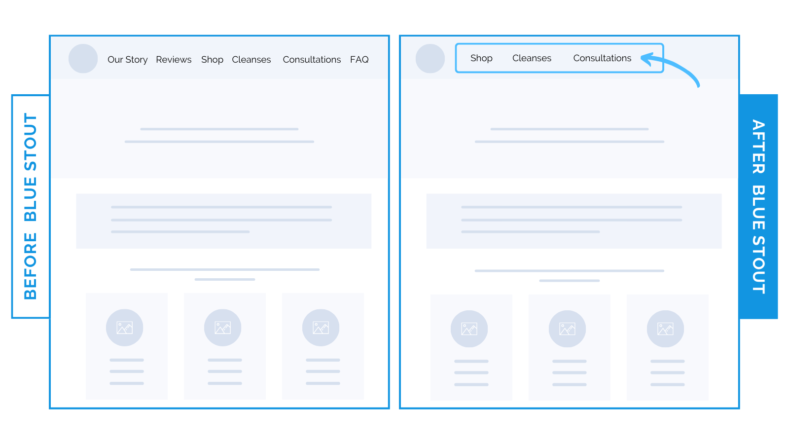
For a health and wellness brand, we reduced their navigation menu by half to only include three links. This led to a narrower focus on what historically leads to the most purchases (and highest revenue per user).
It also minimized decisions for the customer, leading to a 29% lift in conversions.
Here’s Why it Worked
Most new customers scroll on the navigation first to find the right product for them.
Packing the navigation menu with links that don’t lead directly to shopping opportunities takes up space and leads to fatigue and bounces.
It helped direct customers to the products they care about faster.
What Most Brands Do Wrong
Many brands stuff their navigation menus with many choices, which can overwhelm customers and hinder the path to purchase.
They also often disregard insights customer data can provide, leading to navigation designs that do not align with actual customer behaviors.
Provide full access to the site while keeping your navigation menu clear of clutter.
Link only to your most valuable pages in the top navigation menu, and make use of the footer for overflow.
Steps to Try Today
Do you have an overstuffed navigation? Analyze your data to understand your highest revenue pages. Then, reduce clutter in your navigation by only including the most impactful links.
Then, make sure to test!