If your luxury branding is hurting conversions, try these 3 tests.
Balance luxury aesthetics with trust signals to boost conversions.
People buy with emotion and justify with logic.
Your luxury design catches their attention. But your proof silences their objections.
How do you blend and balance both to strengthen your credibility?
Below are three real (and simple) ways to do this.
1 – Sitewide banner review stars
Notification bars only take up 5% of a page, but most don’t use them properly.
If you already have a beautiful, luxury design, the last thing you want to do is distract from it.
Instead, complement it. Sticky notification bars are the first thing visitors see. Use them wisely.
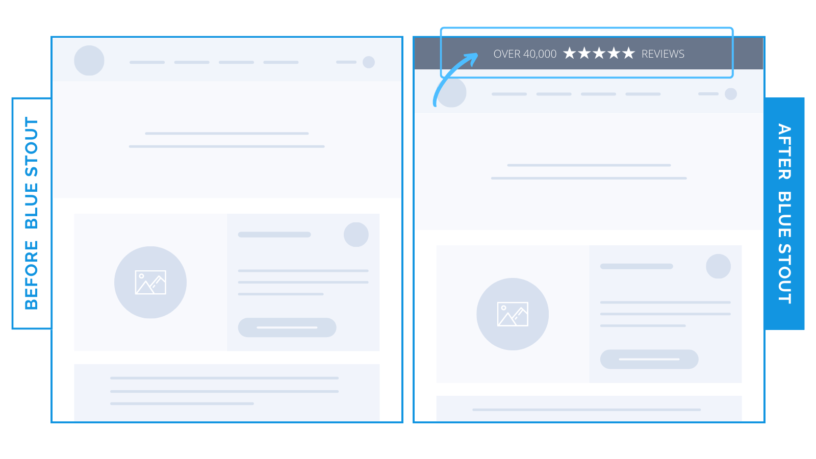
For an 8-figure jewelry brand, we used their best social proof (40k 5-star reviews) in a sitewide banner.
It added $500k in new revenue:

It’s barely there – but impacts every page and links to best-sellers right away.
2 – Social proof next to a CTA like ‘Add-To-Cart’
Fact: you won’t sell anything if your product page doesn’t build trust.
One way to do this? Create a sense of urgency with real social data.
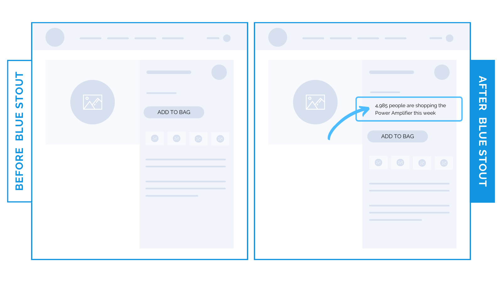
For a high-end electronics brand, we included a line of text before the ATC button showing how many visitors viewed their best-selling product.
This visitor data, “4,958 people are shopping this week” increased conversions by 42%.

Nobody likes missing out on what’s popular. Prove popularity and reduce perceived risk.
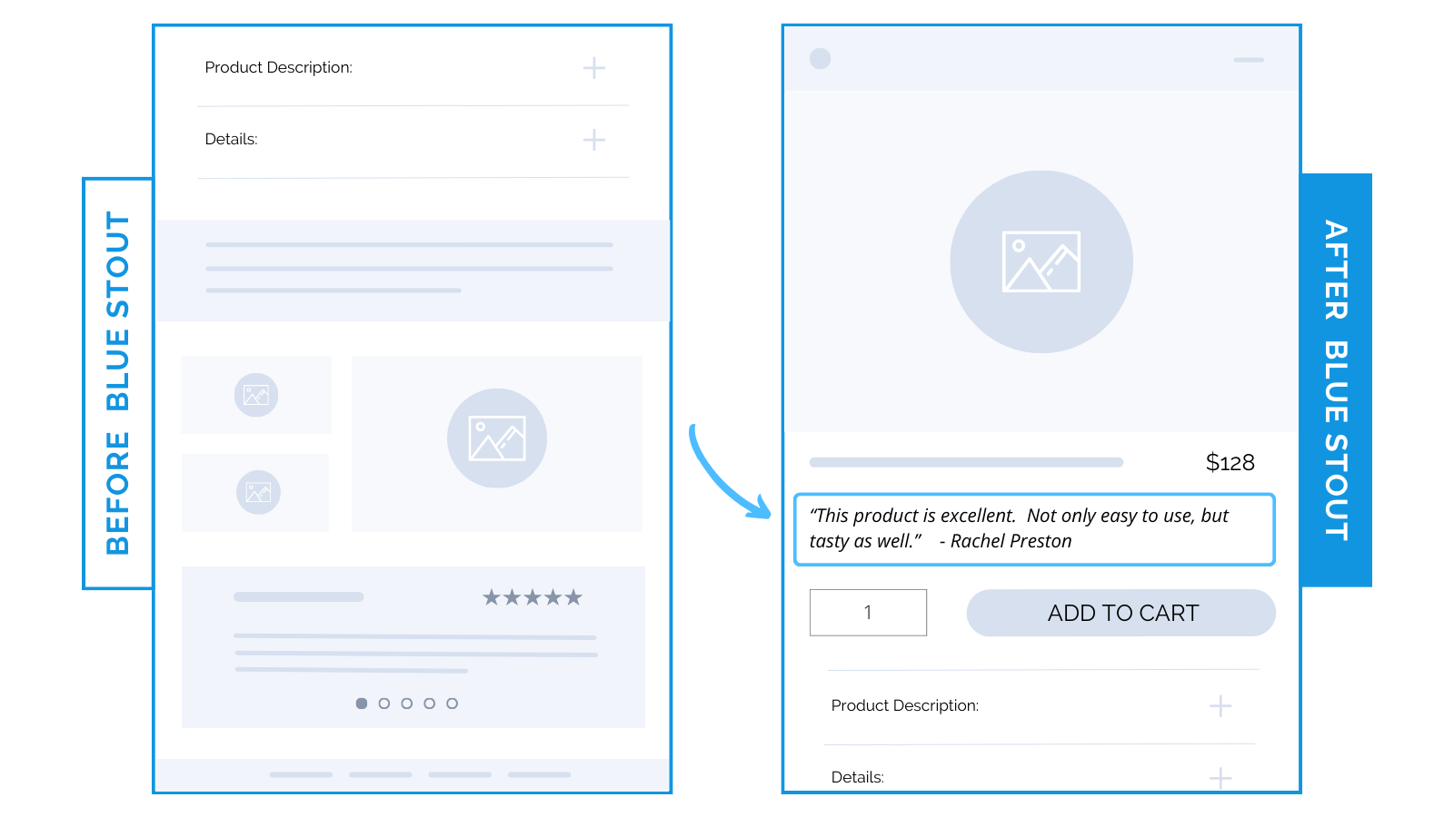
Or, in the same place, add a short customer review to share a transformation story.
For a CPG brand, conversions boosted by 5% with a review above the ATC button:

Small testimonials are anything but: they’re real, they’re believable, and they align with what the buyer actually wants.
Placing these security signals in the buy box balances out a great design.
3 – Promotional message in icon lineup
Your customer will have questions about your product, process, and the perceived risk of a purchase.
Anticipate and address these 3 Ps and you’ll be more likely to convert first-time buyers.
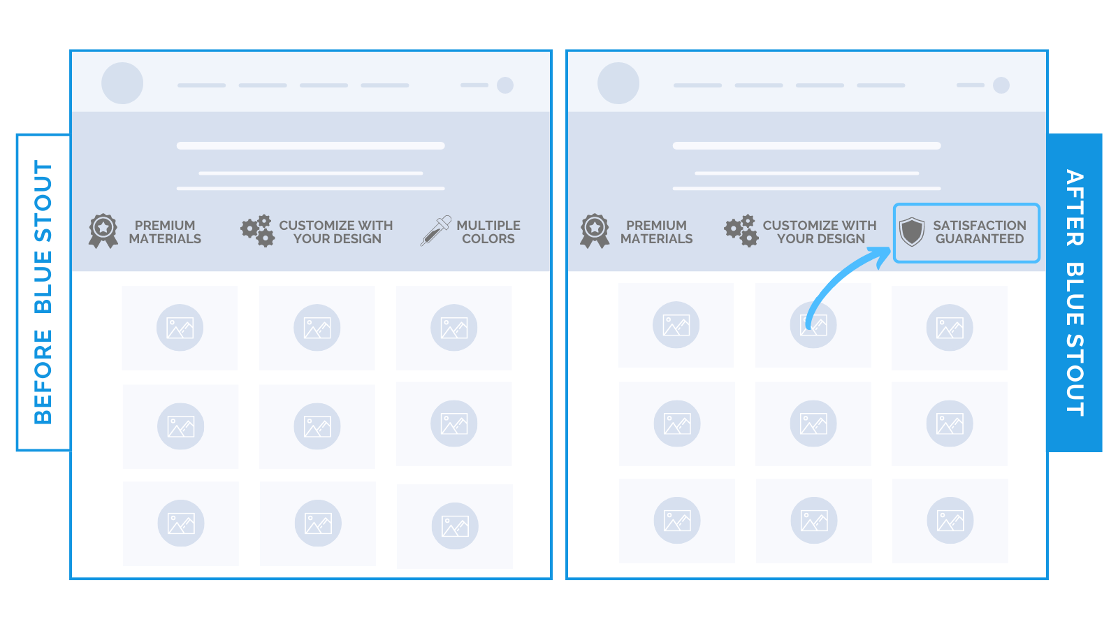
Shipping, returns, warranties—anything that relates to the way you are going to deliver your product should be noted. Do this with design-friendly icons.
We saw a 39% lift in conversions for a niche brand that sells custom products when we replaced a value proposition icon on the Collections page with ‘FREE SHIPPING’.

Save your product attributes for the actual product page. Mention your process benefits to drive the sale, and do so without an unnecessary block of text.
Trust, clarity, and reliability should go hand-in-hand with aesthetics.
You CAN have both and turn prospects into happy customers.
Steps to Try Today
Does your luxury design lack trust signals?
Use these test wins for yourself and enjoy better conversions.
Good luck!


