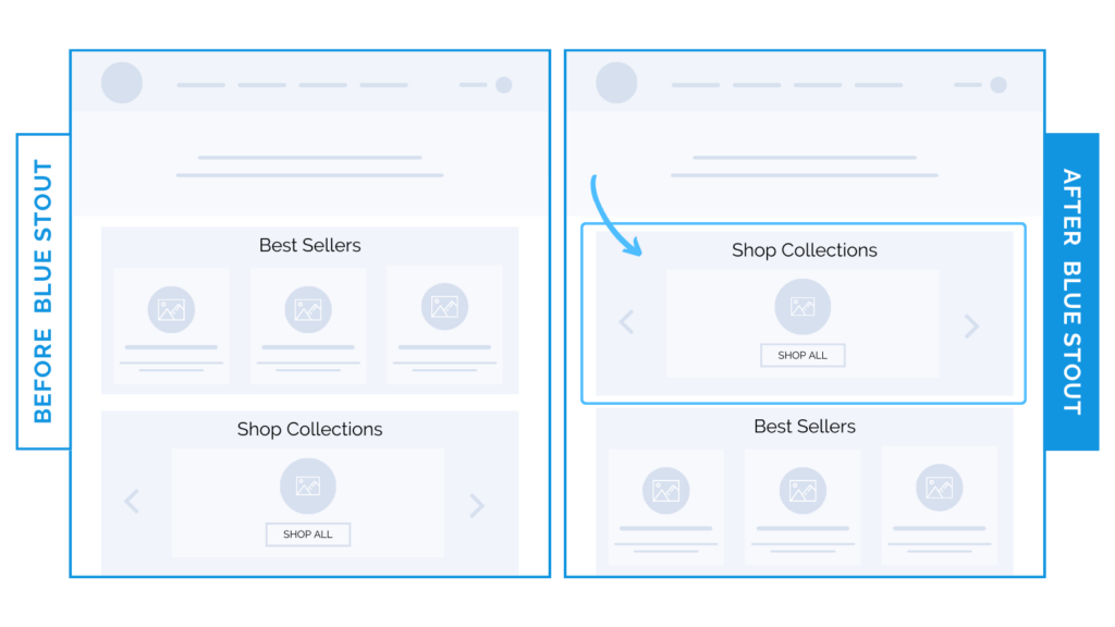
For apparel brand, product categories high up on the homepage win a 6% conversion lift over specific product features.
Prioritize broad collections over specific products early on the homepage to give buyers a full view of your offerings.
For an apparel brand, we tested moving product categories up on the homepage and single product sliders down.
This allowed customers to view more collections right away, leading to a lift in conversions.

Here’s Why it Worked
The goal of every page? Get your potential buyer to click to the next.
Your homepage brings in the most diverse traffic.
Since your brand’s collections are broad, present these first for the most views.
Customers will be much more likely to find what appeals to their needs in a quick skim, leading them to click, view, and buy.
What Most Brands Do Wrong
Most brands assume they know exactly what a customer is looking for and only feature these items.
In doing so, they dismiss the needs of buyers who may be interested in other product categories.
Don’t miss an opportunity to reach more buyers!
Go broad by featuring your top collections first, and let them decide what appeals most after they click through to the collection.
Steps to Try Today
Does your brand have a large catalog? Consider sharing product categories on the top of your homepage before individual products to appeal to more customers.


