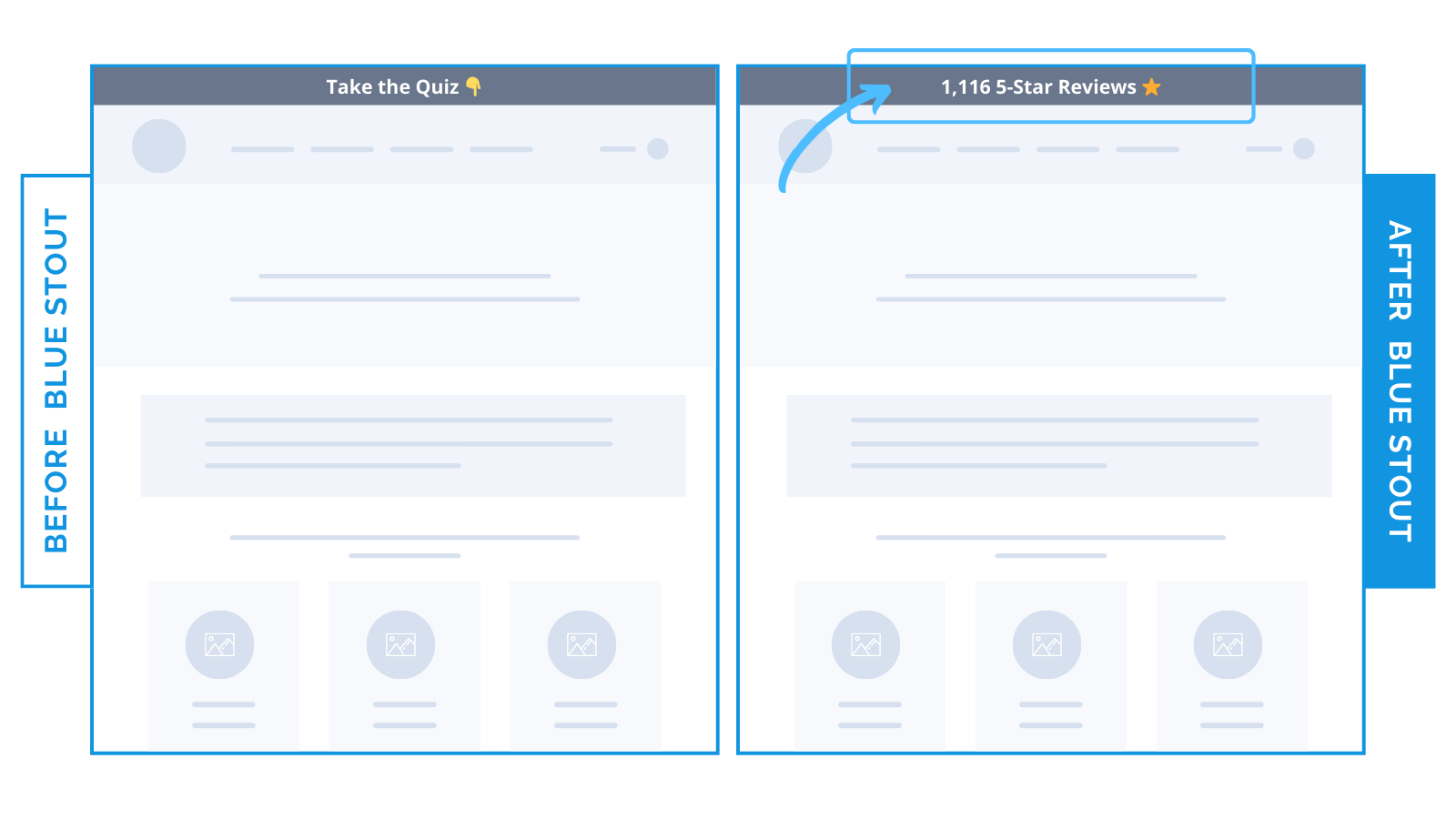
Quiz removed early on homepage for a 27% boost in conversions
Don’t make your QUIZ the first place you send new visitors.
Instead, use it as a secondary option to guide those who haven’t yet found the right product on your homepage or navigation.
One of our clients, a CPG brand specializing in wellness teas, used an announcement bar sitewide to encourage visitors to take a product-matching quiz.
The problem? The quiz was too high up on the page.
We replaced the quiz prompt with a potent piece of social proof instead:
Old: “Take the Quiz👇”
New: “1,116 5-Star Reviews ⭐”
The social proof led to a 26.8% lift in conversions.

Here’s Why it Worked
Showing social proof FIRST was far more effective than a quiz for this CPG brand.
Why?
While quizzes are an effective way to keep customers in the funnel when they’re about to abandon the site, they’re not a good first step for those meeting your brand.
Customers need assurance they’re making the right choice, especially when it comes to wellness.
Social proof speaks to the product’s effectiveness and popularity at the top of every page.
This validation gave customers a reason to browse and buy instead of taking a multi-step quiz.
What Most Brands Do Wrong
Many brands see the benefits of engaging customers through interactive features like quizzes, but end up mentioning them too early.
A quiz requires the customer to answer a series of questions – an elongated process.
Instead, show buyers what they need right away on your homepage, main menu, and messaging WITHOUT needing to take a quiz.
THEN, use social proof to validate your product.
Reserve your quizzes for when customers can’t find what they need and are about to abandon.
Steps to Try Today
Do you have a quiz too soon in the customer journey? Mention it later in the funnel for the best results.
Then, make sure to test!


