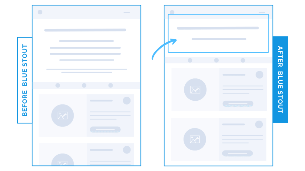
Removing ONE line of text boosted conversions 33%.
In a recent test, we reduced the copy of a landing page headline on mobile. Products were then higher up the page and into view. The result? A 33.4% lift in conversions.
Keep your hook potent and succinct. Get your products into view FASTER.

Here’s Why it Worked
On mobile, there’s limited page real estate. You need to do more with less.
And on this specific landing page, we were presenting the customer with multiple products to choose from.
When we reduced the headline copy on a landing page from three lines to two, it delivered more impact AND brought the product offers higher on the page on mobile (especially on iPhones).
This led to a 33.4% boost in conversion rates for the landing page.
With multiple options available, getting the customer to the offers FAST was key.
What Most Brands Do Wrong
Most brands are lazy with their copy.
They design and write for desktop, but don’t consider how it translates to mobile.
Even worse, they don’t test different copy or sentence lengths.
Make your headlines potent, inspiring, and simple. They will be easier for your customer to consume AND will create more space for your products.
Try it out:
Scrap the unnecessary! Test, review, repeat.


