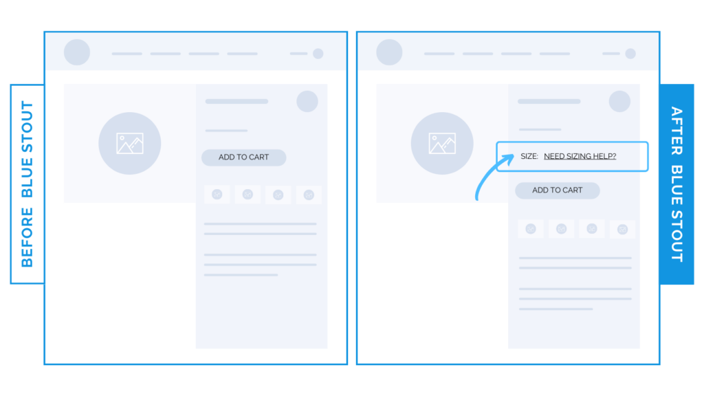
Shortcut link on product page lifts conversions by 14% for children’s apparel brand.
Customers don’t want to make decisions.
They want to be told what to buy and how to buy it.
This means anticipating your customer’s key questions to avoid decision fatigue and lost sales.
For example:
In a recent product page A/B test, we added a link to sizing details next to the size variants selector in the buy box.
It lifted conversions by 14% for an apparel brand.
Place answers to key questions EXACTLY where they will ask to remove decision fatigue.

Here’s Why it Worked
Your goal on every product page:
- Catch the customer’s attention.
- Then, silence their objections.
How can you be sure this happens?
Know the questions your customer will have. Then, answer them at the point they’ll ask.
For children’s apparel, sizing is tricky (no XS-XL options here).
We made it easy for the customer to make an informed purchase WITHOUT scrolling to the bottom of the page for the information they need.
By clicking the link next to the size variants, they automatically jump to detailed info.
What Most Brands Do Wrong
Most apparel brands have detailed product information available.
But they aren’t placing it where the info could be most useful: right where customers are asking.
By putting it next to the size options, the buyer’s product questions are answered without leading them far from the ATC button.
Remember this:
Your customer wants to be told: what to buy, where to buy it, and why they should feel good about it.
Steps to Implement Today
What are your customer’s barriers to purchase?
What questions MUST be answered for them to move forward?
Answer these right where they’re asking.


